上一篇
HTML如何居中div?
在HTML中使div居中显示,常用方法包括:使用 margin: 0 auto配合固定宽度实现水平居中;通过Flex布局(父容器设置 display: flex; justify-content: center; align-items: center)实现水平和垂直居中;或利用Grid布局( display: grid; place-items: center)快速居中,绝对定位结合 transform: translate(-50%, -50%)也是常见方案。
在HTML中将<div>元素居中显示是前端开发中的常见需求,涉及多种CSS技术,以下是详细方法,覆盖不同场景(水平居中、垂直居中、水平垂直同时居中)及兼容性考量:
水平居中方法
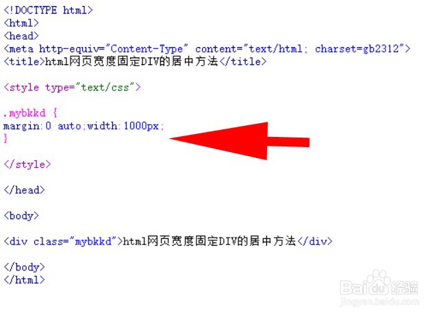
margin: 0 auto + 固定宽度
<div class="center-h">内容</div> <style> .center-h { width: 300px; /* 必须指定宽度 */ margin: 0 auto; /* 左右外边距自动计算 */ background: #eee; } </style>
原理:auto 外边距平分剩余空间,需父元素为块级容器(如 body 或 div)。
适用:已知宽度的块级元素。
Flexbox 布局
<div class="parent"> <div class="child">内容</div> </div> <style> .parent { display: flex; justify-content: center; /* 水平居中 */ } .child { width: 50%; /* 可选宽度 */ } </style>
优势:响应式友好,无需固定子元素宽度。
Grid 布局
<div class="parent"> <div class="child">内容</div> </div> <style> .parent { display: grid; place-items: center; /* 同时水平垂直居中 */ } </style>
提示:place-items: center 是 justify-items 和 align-items 的简写。
垂直居中方法
Flexbox 布局
<div class="parent"> <div class="child">内容</div> </div> <style> .parent { display: flex; align-items: center; /* 垂直居中 */ height: 300px; /* 父元素需有高度 */ } </style>
绝对定位 + transform
<div class="parent"> <div class="child">内容</div> </div> <style> .parent { position: relative; height: 300px; } .child { position: absolute; top: 50%; /* 从顶部下移50% */ transform: translateY(-50%); /* 上移自身高度的50% */ } </style>
适用:子元素高度未知。
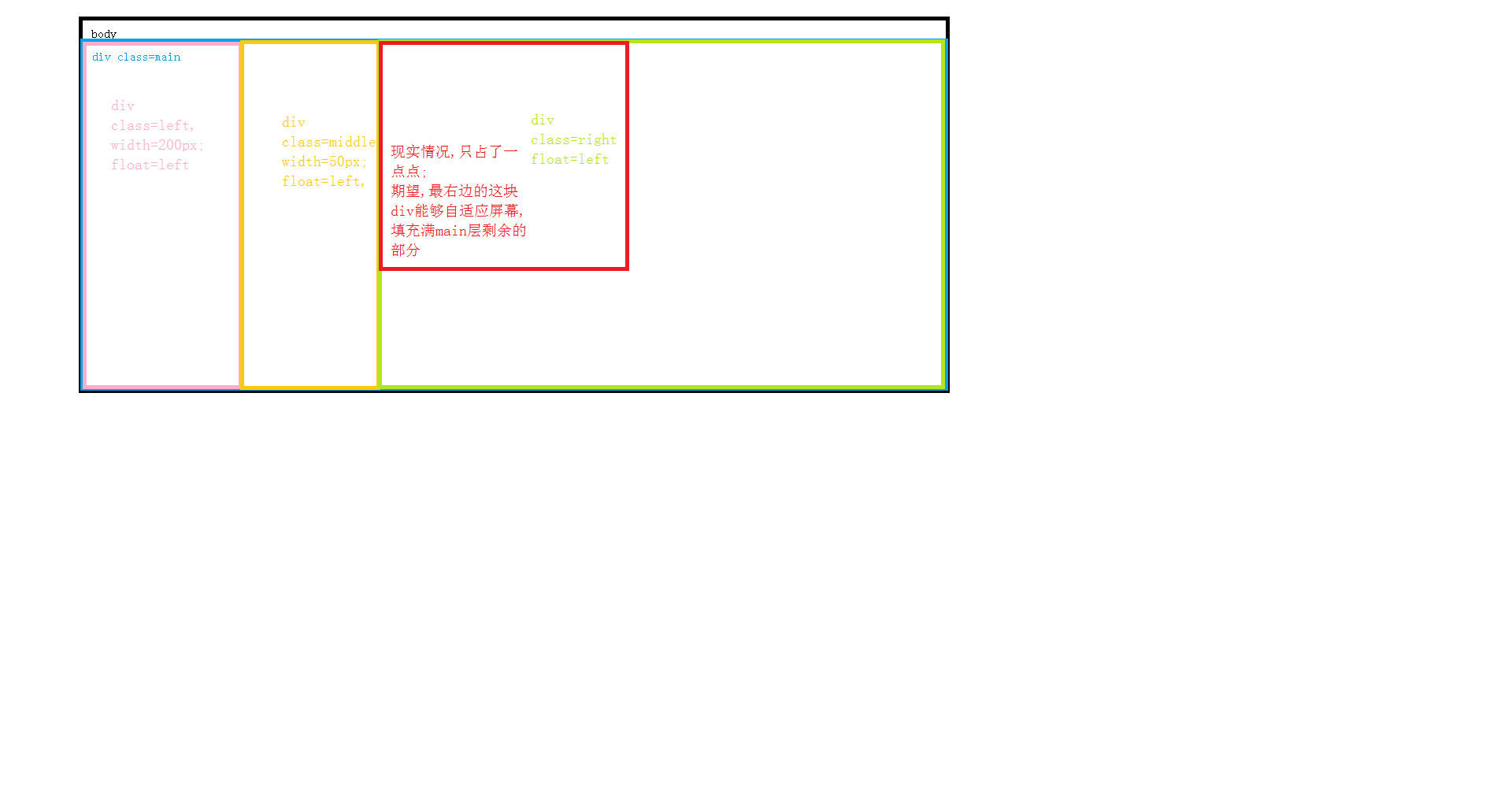
水平垂直同时居中
Flexbox 方案(推荐)
<div class="parent"> <div class="child">内容</div> </div> <style> .parent { display: flex; justify-content: center; /* 水平 */ align-items: center; /* 垂直 */ height: 100vh; /* 视口高度 */ } </style>
Grid 方案
<div class="parent"> <div class="child">内容</div> </div> <style> .parent { display: grid; place-items: center; /* 一行代码实现居中 */ height: 100vh; } </style>
绝对定位 + transform
<div class="parent"> <div class="child">内容</div> </div> <style> .parent { position: relative; height: 100vh; } .child { position: absolute; top: 50%; left: 50%; transform: translate(-50%, -50%); /* 修正自身宽高偏移 */ } </style>
适用:兼容旧浏览器(IE9+)。
绝对定位 + 负边距(已知宽高)
<div class="parent"> <div class="child">内容</div> </div> <style> .parent { position: relative; height: 300px; } .child { position: absolute; top: 50%; left: 50%; width: 200px; height: 100px; margin-top: -50px; /* 高度的一半 */ margin-left: -100px; /* 宽度的一半 */ } </style>
局限:需精确计算宽高。
兼容性与最佳实践
-
现代方案优先:
- 使用 Flexbox(兼容 IE10+)或 Grid(兼容 IE11+部分属性)。
- 避免过时方法(如 table-cell)。
-
响应式考虑:
- Flexbox/Grid 自动适应不同屏幕尺寸。
- 结合 max-width 防止内容溢出: .child { max-width: 90%; margin: 0 auto; }
-
旧浏览器降级:
- 绝对定位方案作为备用(支持 IE8+)。
- 使用 CSS 前缀工具(如 Autoprefixer)。
- 首选 Flexbox:代码简洁、响应式强,适用于大多数场景。
- 未知尺寸元素:用 transform: translate 修正定位。
- 复杂布局:Grid 提供更强大的二维控制。
- 避免滥用:简单水平居中用 margin: 0 auto 更轻量。
总结建议
引用说明参考 MDN Web Docs 的 CSS 布局指南、W3C 的 Flexbox 和 Grid 规范,以及 Can I Use 的浏览器兼容性数据,实践代码经过主流浏览器(Chrome, Firefox, Safari, Edge)测试验证。