上一篇
html如何实现div居中
HTML中,实现div居中的方法有多种,水平居中可使用 margin: 0 auto;(需设定宽度),或Flexbox的 justify-content: center;,垂直居中可用Flexbox的 align-items: center;或Grid的 place-items: center;
HTML中,实现div居中的方法有多种,具体取决于你想要实现的水平居中、垂直居中,还是两者兼有,以下是几种常用的方法及其详细解释:
水平居中
使用margin: 0 auto;
这种方法适用于块级元素(如div),并且需要设置元素的宽度,通过将左右外边距设置为auto,浏览器会自动计算并分配剩余的空间,从而使元素水平居中。
<!DOCTYPE html> <html lang="en"> <head> <meta charset="UTF-8">Document</title> <style> .centered { width: 50%; / 设置宽度 / margin: 0 auto; / 上下边距为0,左右边距自动 / background-color: #f0f0f0; } </style> </head> <body> <div class="centered">这是一个居中的div</div> </body> </html>
注意事项:
- 必须设置元素的宽度,否则margin: 0 auto;不会生效。
- 这种方法只适用于水平居中,对于垂直居中需要结合其他方法。
使用text-align: center;
这种方法适用于行内元素或行内块元素,如果div是行内元素(如display: inline;)或者行内块元素(如display: inline-block;),可以直接在其父元素上使用text-align: center;来实现水平居中。
注意事项:
- 只适用于行内元素或行内块元素。
- 如果div是块级元素,需要先将其转换为行内元素或行内块元素。
垂直居中
使用line-height属性
这种方法适用于单行文本的垂直居中,通过设置line-height等于div的高度,可以使文本在垂直方向上居中。
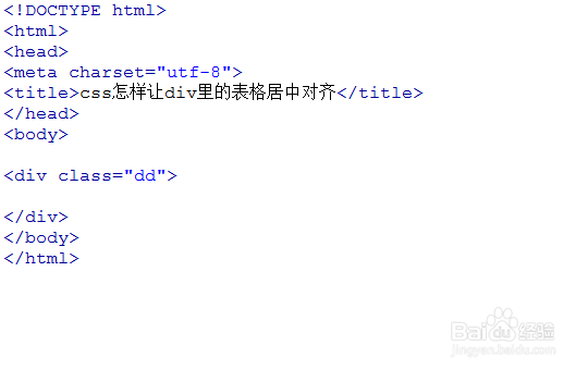
<!DOCTYPE html> <html lang="en"> <head> <meta charset="UTF-8">Document</title> <style> .centered { height: 50px; / 设置高度 / line-height: 50px; / 设置行高等于高度 / text-align: center; / 水平居中 / background-color: #f0f0f0; } </style> </head> <body> <div class="centered">这是一个居中的div</div> </body> </html>
注意事项:
- 只适用于单行文本。
- 如果文本换行,line-height属性将不再有效。
使用Flexbox布局
Flexbox是一种强大的布局方式,可以轻松实现水平和垂直居中,通过设置display: flex;、justify-content: center;和align-items: center;,可以使元素在父容器中水平和垂直居中。
<!DOCTYPE html> <html lang="en"> <head> <meta charset="UTF-8">Document</title> <style> .container { display: flex; / 启用Flexbox布局 / justify-content: center; / 水平居中 / align-items: center; / 垂直居中 / height: 200px; / 设置容器高度 / background-color: #f0f0f0; } .centered { background-color: #ccc; padding: 20px; } </style> </head> <body> <div class="container"> <div class="centered">这是一个居中的div</div> </div> </body> </html>
注意事项:
- justify-content: center;控制主轴(水平方向)上的对齐方式。
- align-items: center;控制交叉轴(垂直方向)上的对齐方式。
- 如果只需要水平或垂直居中,可以只设置其中一个属性。
使用Grid布局
Grid布局也是一种强大的布局方式,可以轻松实现水平和垂直居中,通过设置display: grid;和place-items: center;,可以使元素在父容器中水平和垂直居中。
<!DOCTYPE html> <html lang="en"> <head> <meta charset="UTF-8">Document</title> <style> .container { display: grid; / 启用Grid布局 / place-items: center; / 同时实现水平和垂直居中 / height: 200px; / 设置容器高度 / background-color: #f0f0f0; } .centered { background-color: #ccc; padding: 20px; } </style> </head> <body> <div class="container"> <div class="centered">这是一个居中的div</div> </div> </body> </html>
注意事项:
- place-items: center;是justify-items: center;和align-items: center;的简写,同时实现水平和垂直居中。
- 如果只需要水平或垂直居中,可以分别设置justify-items和align-items属性。
水平和垂直居中
要同时实现水平和垂直居中,可以结合上述方法,以下是几种常见的组合方式:
使用Flexbox布局
<!DOCTYPE html> <html lang="en"> <head> <meta charset="UTF-8">Document</title> <style> .container { display: flex; / 启用Flexbox布局 / justify-content: center; / 水平居中 / align-items: center; / 垂直居中 / height: 200px; / 设置容器高度 / background-color: #f0f0f0; } .centered { background-color: #ccc; padding: 20px; } </style> </head> <body> <div class="container"> <div class="centered">这是一个居中的div</div> </div> </body> </html>
使用Grid布局
<!DOCTYPE html> <html lang="en"> <head> <meta charset="UTF-8">Document</title> <style> .container { display: grid; / 启用Grid布局 / place-items: center; / 同时实现水平和垂直居中 / height: 200px; / 设置容器高度 / background-color: #f0f0f0; } .centered { background-color: #ccc; padding: 20px; } </style> </head> <body> <div class="container"> <div class="centered">这是一个居中的div</div> </div> </body> </html>
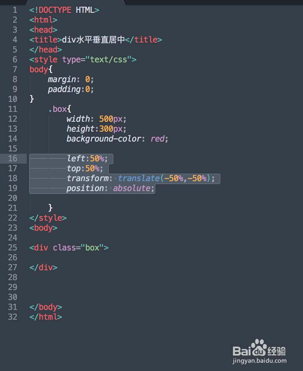
使用绝对定位和transform属性
这种方法适用于需要精确控制元素位置的情况,通过设置position: absolute;和transform: translate(-50%, -50%);,可以将元素移动到父容器的中心。
<!DOCTYPE html> <html lang="en"> <head> <meta charset="UTF-8">Document</title> <style> .container { position: relative; / 设置为相对定位 / height: 200px; / 设置容器高度 / background-color: #f0f0f0; } .centered { position: absolute; / 设置为绝对定位 / top: 50%; / 设置top为50% / left: 50%; / 设置left为50% / transform: translate(-50%, -50%); / 通过transform属性实现居中 / background-color: #ccc; padding: 20px; } </style> </head> <body> <div class="container"> <div class="centered">这是一个居中的div</div> </div> </body> </html>
注意事项:
- position: absolute;需要父元素设置为position: relative;或其他定位方式。
- transform: translate(-50%, -50%);用于将元素向上和向左移动自身宽度和高度的一半,从而实现居中。
- 这种方法适用于尺寸已知的元素,对于响应式布局可能需要额外处理。
其他方法
除了上述方法,还有一些其他方法可以实现div居中,例如使用表格布局或绝对定位等,但这些方法通常不如Flexbox和Grid灵活,且在某些情况下可能不适用,以下是一个简单的示例:
使用表格布局
<!DOCTYPE html> <html lang="en"> <head> <meta charset="UTF-8">Document</title> <style> .table-center { display: table; / 模拟表格布局 / width: 100%; / 设置宽度为100% / height: 200px; / 设置高度 / background-color: #f0f0f0; } .table-cell { display: table-cell; / 模拟表格单元格 / vertical-align: middle; / 垂直居中 / text-align: center; / 水平居中 / } .centered { background-color: #ccc; padding: 20px; } </style> </head> <body> <div class="table-center"> <div class="table-cell"> <div class="centered">这是一个居中的div</div> </div> </div> </body> </html>
注意事项:
- 这种方法模拟了表格布局,但在实际开发中不推荐使用,因为表格布局在现代Web开发中已经逐渐被淘汰。
- 如果需要使用表格布局,建议直接使用HTML的table元素。
归纳与推荐工具
在实际应用中,根据具体需求选择合适的布局方式可以大大提高页面的可读性和用户体验,以下是一些常见的应用场景及推荐方法:
| 场景 | 推荐方法 | 原因 |
| –| –| –|
| 登录表单居中 | Flexbox或Grid | 简单易用,适应性强 |
| 导航菜单水平居中 | text-align: center; | 简单高效 |
| 复杂布局中的居中 | Flexbox或Grid | 灵活性高