上一篇
html中input如何居中
HTML中,可通过CSS实现input居中,常见方法有:将父容器text-align设为center;或把input设为块级元素,margin设为0 auto;也可使用Flexbox布局,将父容器display设为flex,justify-content和align-items设为center
HTML中,要使<input>元素居中,有多种方法可以实现,以下是几种常见且有效的方法:
使用CSS的text-align属性
这种方法适用于将<input>元素包裹在一个父级容器内,并对该容器设置text-align: center,这样可以使<input>元素在水平方向上居中显示。
示例代码:
<!DOCTYPE html> <html lang="en"> <head> <meta charset="UTF-8">Input Centering</title> <style> .center-container { text-align: center; / 可选:设置宽度和边距以控制容器大小 / width: 50%; margin: 0 auto; } </style> </head> <body> <div class="center-container"> <input type="text" placeholder="请输入内容"> </div> </body> </html>
说明:
- .center-container类设置了text-align: center,使得其内部的<input>元素水平居中。
- 通过设置width和margin,可以进一步控制容器的大小和位置。
使用CSS的margin属性
通过设置<input>元素的margin属性为auto,可以实现水平居中。
示例代码:
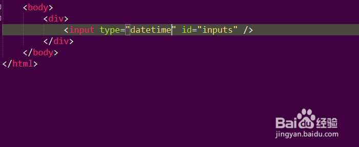
<!DOCTYPE html> <html lang="en"> <head> <meta charset="UTF-8">Input Centering</title> <style> .centered-input { display: block; / 确保input是块级元素 / margin: 0 auto; / 上下边距为0,左右边距自动 / width: 50%; / 可选:设置input宽度 / } </style> </head> <body> <input type="text" class="centered-input" placeholder="请输入内容"> </body> </html>
说明:
- .centered-input类设置了display: block,使<input>成为块级元素。
- margin: 0 auto使得<input>在其父容器中水平居中。
- 通过设置width,可以控制<input>的宽度。
使用Flexbox布局
Flexbox是一种强大的布局方式,可以轻松实现元素的水平和垂直居中。
示例代码:
<!DOCTYPE html> <html lang="en"> <head> <meta charset="UTF-8">Input Centering</title> <style> .flex-container { display: flex; / 设置为Flex容器 / justify-content: center; / 水平居中 / align-items: center; / 垂直居中 / height: 100vh; / 使容器占满整个视口高度 / } </style> </head> <body> <div class="flex-container"> <input type="text" placeholder="请输入内容"> </div> </body> </html>
说明:
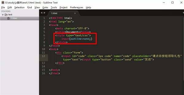
- .flex-container类设置了display: flex,将其子元素(即<input>)放入Flex容器中。
- justify-content: center实现水平居中。
- align-items: center实现垂直居中。
- height: 100vh使容器占满整个视口高度,确保<input>在视口中垂直居中。
使用Grid布局
Grid布局是另一种强大的布局方式,适用于复杂的页面布局,通过将父容器设为Grid容器,并使用place-items属性,可以轻松实现子元素的居中对齐。
示例代码:
<!DOCTYPE html> <html lang="en"> <head> <meta charset="UTF-8">Input Centering</title> <style> .grid-container { display: grid; / 设置为Grid容器 / place-items: center; / 水平和垂直居中 / height: 100vh; / 使容器占满整个视口高度 / } </style> </head> <body> <div class="grid-container"> <input type="text" placeholder="请输入内容"> </div> </body> </html>
说明:
- .grid-container类设置了display: grid,将其子元素(即<input>)放入Grid容器中。
- place-items: center同时实现水平和垂直居中。
- height: 100vh使容器占满整个视口高度,确保<input>在视口中垂直居中。
使用Bootstrap框架
如果你使用了Bootstrap框架,可以利用其内置的类来快速实现<input>元素的居中对齐。
示例代码:

<!DOCTYPE html> <html lang="en"> <head> <meta charset="UTF-8">Input Centering</title> <!-引入Bootstrap CSS --> <link href="https://cdn.jsdelivr.net/npm/bootstrap@5.3.0/dist/css/bootstrap.min.css" rel="stylesheet"> </head> <body> <div class="container d-flex justify-content-center align-items-center" style="height: 100vh;"> <input type="text" class="form-control w-50" placeholder="请输入内容"> </div> </body> </html>
说明:
- .container类是Bootstrap的容器类,用于设置固定宽度和响应式布局。
- d-flex类将容器设置为Flex容器。
- justify-content-center和align-items-center分别实现水平和垂直居中。
- style="height: 100vh;"使容器占满整个视口高度。
- .form-control和.w-50是Bootstrap的类,分别用于设置表单控件样式和宽度。
相关问答FAQs
问题1:如何在不同屏幕尺寸下保持<input>元素的居中效果?
解答:为了确保在不同屏幕尺寸下<input>元素都能保持居中,可以使用响应式设计技术,结合使用媒体查询和百分比单位来设置<input>的宽度和边距,使用Flexbox或Grid布局也可以更好地适应不同屏幕尺寸,具体实现可以参考以下代码:
@media (max-width: 600px) { .centered-input { width: 80%; } } @media (min-width: 601px) and (max-width: 1200px) { .centered-input { width: 50%; } } @media (min-width: 1201px) { .centered-input { width: 30%; } }
通过这种方式,可以根据屏幕宽度动态调整<input>的宽度,从而保持其在不同设备上的居中效果。
问题2:如何在表格中使<input>元素居中?
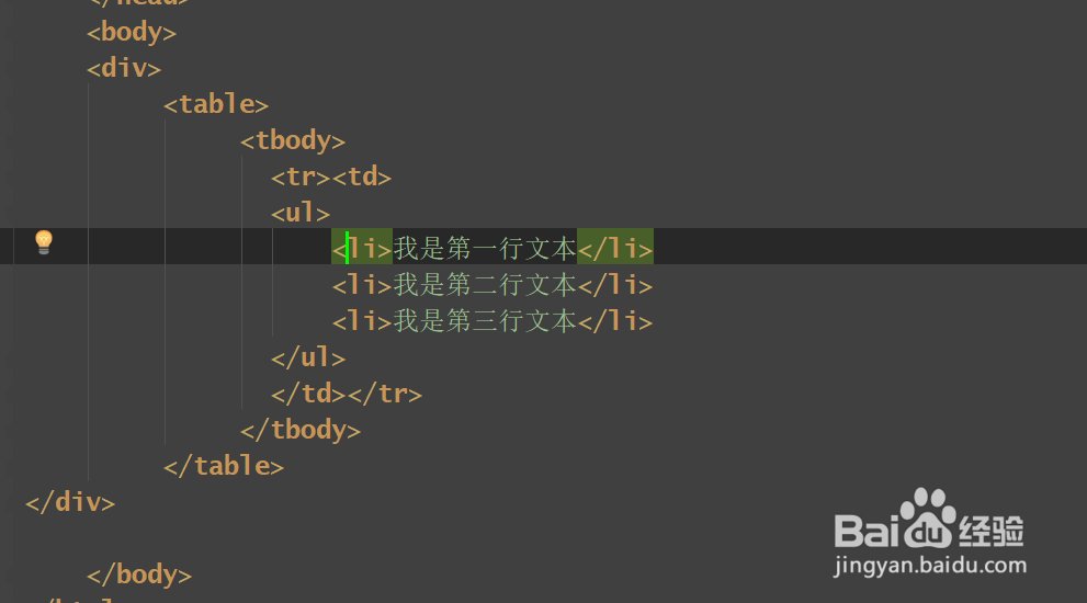
解答:在表格中使<input>元素居中,可以通过设置表格单元格的text-align属性为center来实现,还可以使用CSS选择器选中表格内的<input>并应用margin: 0 auto使其水平居中,如果使用了Bootstrap等CSS框架,可以利用框架提供的类来快速实现居中效果,具体实现可以参考以下代码:
<table> <tr> <td style="text-align: center;"> <input type="text" value="居中输入"> </td> </tr> </table>