上一篇
html 如何控制位置
HTML 中,可以通过 CSS 来控制元素的位置,使用 position 属性(如 static、 relative、 absolute、
传统布局:表格(Table)与框架(Frame)
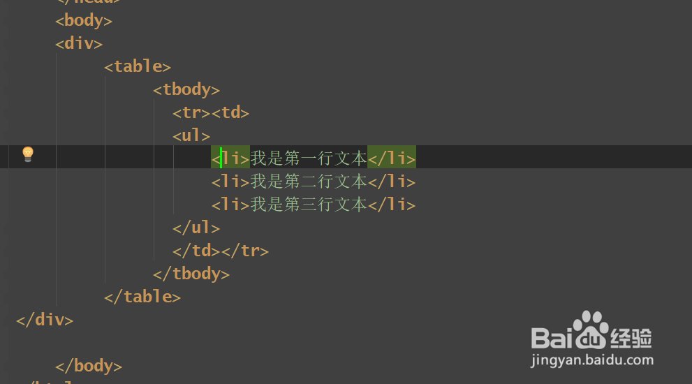
在CSS普及前,表格是主要的布局工具,通过<table>划分为行和列,但这种方式语义化差且代码冗余。
<table border="1"> <tr> <td>左侧栏</td> <td>主内容</td> </tr> </table>
缺点:表格用于布局违背语义化原则,维护困难,不适应响应式设计,现代开发中仅建议用于展示表格数据。
CSS基础定位:静态(Static)、相对(Relative)、绝对(Absolute)、固定(Fixed)
静态定位(Static)
默认值,元素按文档流排列,无法通过top、left等属性偏移。
相对定位(Relative)
元素相对于自身原位置偏移,但仍占据原空间。
应用场景:微调元素位置,如导航栏下拉菜单。
绝对定位(Absolute)
元素相对于最近非静态定位的祖先元素(即具有position: relative/absolute/fixed的父元素)定位,脱离文档流。
.container { position: relative; } .abs-box { position: absolute; top: 50px; left: 50px; }
注意:若没有符合条件的祖先元素,则相对于浏览器窗口定位。
固定定位(Fixed)
元素相对于浏览器窗口固定位置,滚动时保持静止。
.fixed-header { position: fixed; top: 0; left: 0; width: 100%; }
应用场景:顶部导航栏、底部返回按钮。
现代布局:Flexbox与Grid
Flexbox(弹性盒模型)
适用于一维布局(行或列),通过display: flex启用。
- 主轴与侧轴:通过flex-direction定义方向(row/column)。
- 对齐方式:
- justify-content:主轴对齐(如center、space-between)。
- align-items:侧轴对齐(如flex-start、stretch)。
- 元素排序:order属性可调整子元素顺序。
示例:水平居中导航菜单
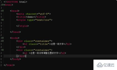
.nav { display: flex; justify-content: center; / 主轴居中 / } .nav-item { margin: 0 15px; }
Grid(网格布局)
适用于二维布局,通过display: grid启用。
- 定义行与列: .grid-container { display: grid; grid-template-columns: repeat(3, 1fr); / 三列等分 / grid-template-rows: 100px auto; / 首行高度100px / }
- 区域命名: .grid-item { grid-area: header; / 对应template-areas定义 / }
- 自动布局:grid-auto-rows与grid-auto-flow控制自动填充规则。
示例:响应式卡片布局
.card-grid { display: grid; grid-template-columns: repeat(auto-fill, minmax(200px, 1fr)); gap: 16px; / 网格间距 / }
浮动(Float)与清除(Clear)
虽然已逐渐被Flexbox取代,但float仍用于文本绕图等场景。
- 左浮动:float: left;让元素向左排列,右侧内容环绕。
- 清除浮动:通过clear: both;或伪元素清除浮动防止高度塌陷。 .sidebar { float: left; width: 25%; } .content { margin-left: 25%; }
定位与层叠顺序(Z-Index)
- z-index:仅对position非静态的元素生效,数值越大越靠前。
- 层叠上下文:若父元素设置position: relative且有z-index,子元素的z-index在该上下文内生效。 .modal { position: fixed; z-index: 1000; / 覆盖其他内容 / }
响应式设计与媒体查询
结合@media调整布局以适应不同屏幕:
@media (max-width: 768px) { .grid-container { grid-template-columns: 1fr; / 移动端单列布局 / } }
综合示例:全屏背景与居中内容
<div class="background"> <div class="content"> <h1>欢迎</h1> <p>这是一个居中的弹窗</p> </div> </div> .background { position: fixed; top: 0; left: 0; width: 100%; height: 100%; background: rgba(0, 0, 0, 0.5); display: flex; justify-content: center; / 水平居中 / align-items: center; / 垂直居中 / } .content { background: white; padding: 20px; border-radius: 8px; }
FAQs
Q1:如何让一个元素始终固定在页面右下角?
A:使用position: fixed并设置bottom: 0; right: 0;,
.fixed-corner { position: fixed; bottom: 0; right: 0; width: 50px; height: 50px; background: #007bff; }
Q2:为什么使用position: absolute时元素会重叠?
A:绝对定位元素脱离文档流,若父容器未设置定位属性(如position: relative),则所有绝对定位子元素均相对于浏览器窗口定位,可能导致重叠。