上一篇
html中div位置如何控制
ML中div位置可通过CSS的position(绝对、相对、固定)、margin、padding及float等属性控制
HTML中,div元素的位置控制是前端开发中的核心技能之一,通过CSS的定位属性(如position)、布局属性(如float、display)以及辅助属性(如margin、padding),可以灵活地调整div在页面中的位置和布局,以下是详细的控制方法及示例:
CSS定位属性控制div位置
绝对定位(position: absolute)
- 原理:
绝对定位的div会脱离文档流,其位置相对于最近的已定位祖先元素(即position值为relative、absolute、fixed或sticky的元素)进行计算,如果没有符合条件的祖先元素,则默认以浏览器窗口(html或body)为参考点。
- 核心属性:
- top、right、bottom、left:定义距离参考点的偏移量。
- z-index:控制层级关系,值越大越靠前。
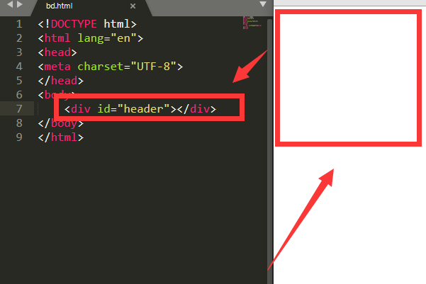
- 示例: <style> .container { position: relative; / 设置为相对定位,作为绝对定位的参考点 / width: 300px; height: 300px; background-color: #f0f0f0; } .absolute-box { position: absolute; top: 50px; left: 100px; width: 100px; height: 100px; background-color: blue; }
</style>
<div class="container"> <div class="absolute-box"></div>
</div>
效果:蓝色div距离容器顶部50px、左侧100px,且不影响其他元素的位置。
相对定位(position: relative)
- 原理:
相对定位的div保留在文档流中,其位置基于元素本身的原始位置进行调整,偏移后,原位置仍会被保留,后续元素不会填补空白。
- 核心属性:
- top、right、bottom、left:定义相对原始位置的偏移量。
- 示例: <style> .relative-box { position: relative; top: 20px; / 向下移动20px / left: 30px; / 向右移动30px / width: 100px; height: 100px; background-color: green; }
</style>
<div class="relative-box"></div>
效果:绿色div相对于其原始位置向下偏移20px、向右偏移30px,但原位置仍被保留。
固定定位(position: fixed)
- 原理:
固定定位的div会脱离文档流,并始终相对于浏览器窗口(而非父元素)进行定位,即使页面滚动也不会改变位置。
- 核心属性:
- top、right、bottom、left:定义距离窗口边缘的偏移量。
- 示例: <style> .fixed-header { position: fixed; top: 0; left: 0; width: 100%; height: 50px; background-color: darkblue; color: white; text-align: center; line-height: 50px; }
</style>
<div class="fixed-header">固定导航栏</div>
<div style="height: 2000px;">页面内容</div>
效果:导航栏始终固定在页面顶部,即使滚动页面也不会消失。
其他布局属性控制div位置
浮动布局(float)
- 原理:
float属性使div脱离文档流,向左或向右浮动,允许其他元素环绕其周围,常用于实现多栏布局。
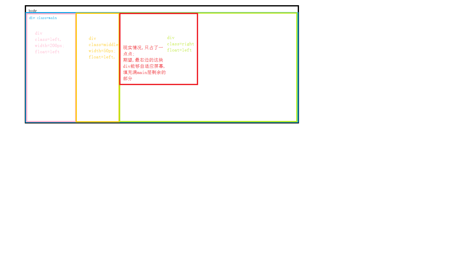
- 示例: <style> .left-box { float: left; width: 150px; height: 100px; background-color: red; } .right-box { float: right; width: 150px; height: 100px; background-color: yellow; }
</style>
<div class="left-box">左侧</div>
<div class="right-box">右侧</div>
<div style="height: 2000px;">主体内容</div>
效果:红色div靠左,黄色div靠右,主体内容环绕两者。
Flex布局(display: flex)
- 原理:
将父元素设置为flex容器后,子元素(如div)可以通过justify-content、align-items等属性实现水平和垂直方向的对齐。
- 示例: <style> .flex-container { display: flex; justify-content: space-between; / 水平分布 / align-items: center; / 垂直居中 / height: 100px; background-color: #ccc; } .flex-item { width: 50px; height: 50px; background-color: purple; }
</style>
<div class="flex-container"> <div class="flex-item">1</div> <div class="flex-item">2</div> <div class="flex-item">3</div>
</div>
效果:三个紫色div在容器内均匀分布且垂直居中。
辅助属性与技巧
属性 作用 示例 margin 设置元素的外边距,控制与其他元素的距离 margin: 10px auto;(水平居中) padding 设置元素的内边距,影响内容与边框的距离 padding: 20px; clear 清除浮动影响,避免元素被浮动元素覆盖 <div style="clear: both;"></div> z-index 控制元素的层级关系,数值越大越靠前 z-index: 10;
常见问题与注意事项
-
绝对定位元素覆盖问题:
如果多个绝对定位元素重叠,可通过z-index调整层级。z-index: 2的元素会覆盖z-index: 1的元素。
-
相对定位与绝对定位的配合:
通常将父元素设置为relative,以便子元素使用absolute时以父元素为参考点,实现弹窗框内的内容定位。
-
固定定位的滚动问题:
固定定位的元素在移动端可能因键盘弹出而被遮挡,需结合viewport单位或JavaScript调整位置。
- 未设置已定位的祖先元素(如父元素未设置relative或absolute)。
- 父元素设置了overflow: hidden,导致绝对定位的子元素被裁剪。
- 偏移量单位错误
FAQs
Q1:如何让一个div始终固定在页面右下角?
A1:使用固定定位,并设置bottom和right属性:
.fixed-corner { position: fixed; bottom: 0; right: 0; width: 50px; height: 50px; background-color: orange; }
Q2:为什么绝对定位的div没有按预期位置显示?
A2:可能是因为以下原因:
- 原理: