上一篇
html开发全屏封面
使用HTML+CSS实现全屏封面:通过`
设置height:100vh 占满视口,配合background-size:cover 铺满背景,display:flex`居中内容,兼容多设备自适应
基础结构与样式
HTML结构
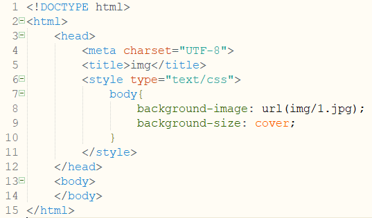
全屏封面通常由容器、背景层、内容层组成,基础结构如下:
<div class="fullscreen-cover">
  <div class="background">
    <!-背景图片或渐变 -->
  </div>
  <div class="content">
    <h1>主标题</h1>
    <p>副标题或描述</p>
    <button>立即体验</button>
  </div>
</div>| 元素 | 作用 | 关键属性 |
|---|---|---|
.fullscreen-cover | 全屏容器 | height: 100vh; width: 100vw; |
.background | 背景层 | background-image/color |
.content | 内容层 | display: flex; align-items: center; |
CSS样式
.fullscreen-cover {
position: relative;
height: 100vh; / 视口高度 /
width: 100vw; / 视口宽度 /
overflow: hidden;
}
.background {
position: absolute;
top: 0;
left: 0;
width: 100%;
height: 100%;
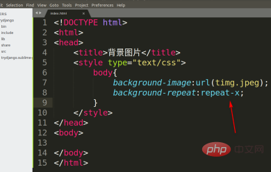
background: url('bg.jpg') no-repeat center center;
background-size: cover; / 覆盖模式 /
filter: blur(5px); / 可选:毛玻璃效果 /
}
.content {
position: relative; / 覆盖在背景层上方 /
z-index: 1;
text-align: center;
color: #fff;
flex-direction: column;
}响应式适配
媒体查询优化
针对不同屏幕尺寸调整内容布局:
@media (max-width: 768px) {
  .content h1 {
    font-size: 2rem; / 缩小标题 /
  }
  .content button {
    padding: 8px 16px; / 调整按钮尺寸 /
  }
}| 场景 | 调整策略 |
|---|---|
| 移动端竖屏 | 缩小文字尺寸、改用垂直布局 |
| 低分辨率屏幕 | 降低背景图质量、简化元素 |
| 横屏模式 | 增加边距防止按钮触达困难 |
交互功能增强
JavaScript事件绑定
document.addEventListener('DOMContentLoaded', () => {
  const button = document.querySelector('.content button');
  button.addEventListener('click', () => {
    // 跳转或展开内容
    window.location.href = 'home.html';
  });
  // 滚动提示动画
  let observer = new IntersectionObserver(entries => {
    entries.forEach(entry => {
      if (entry.isIntersecting) {
        entry.target.classList.add('visible');
      }
    });
  });
  document.querySelectorAll('.content ').forEach(el => {
    observer.observe(el);
  });
});| 功能 | 实现方式 |
|---|---|
| 按钮点击跳转 | addEventListener + window.location |
| 滚动渐现动画 | IntersectionObserver API |
| 背景视差效果 | background-position 联动滚动 |
常见问题与解答
Q1:如何替换全屏背景为纯色渐变?
A:修改 .background 的 background 属性,
.background {
  background: linear-gradient(135deg, #6a11cb 0%, #2575fc 100%);
}
Q2:在移动设备上如何优化全屏封面?
A:建议:
- 移除滤镜效果(如
filter: blur)以提升性能 - 使用
contain替代cover保持背景比例 - 添加
touch-action: manipulation防止误触@media (pointer: coarse) { .background { background-size: contain; filter: none;