上一篇
html如何添加加载动画效果
在 HTML 中可通过 CSS 实现 加载动画:创建带动画类的 ` 元素,用 @keyframes 定义旋转/缩放等效果,通过 animation` 属性绑定,配合 JavaScript
以下是关于 HTML如何添加加载动画效果 的完整指南,包含多种实现方案、代码示例及实用技巧:
核心原理与基础准备
加载动画的本质是通过视觉反馈告知用户「系统正在处理请求」,其核心要素包括:
动态元素(如旋转图标、渐变色块)
时间控制(持续时间、循环次数)
状态管理(开始/结束时机)
▶︎ 必备前置知识
| 技术领域 | 作用说明 | 典型应用场景 |
|---|---|---|
| CSS3动画 | 定义元素运动轨迹与形态变化 | 纯样式驱动的轻量化动效 |
| JavaScript | 动态控制动画启停与逻辑交互 | 复杂状态管理与异步操作 |
| SVG矢量图形 | 高质量缩放且文件体积小 | 精致图标与路径动画 |
| GIF/APNG格式 | 预渲染动画序列 | 兼容性要求高的老旧项目 |
主流实现方案详解
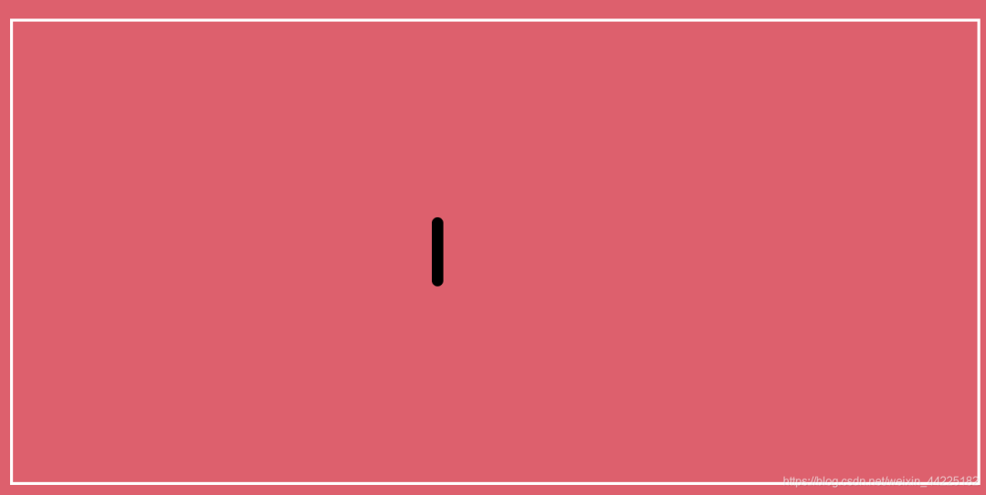
方案1:纯CSS实现(推荐新手)
适用场景:简单页面过渡、按钮点击反馈、小型组件加载提示
关键参数解析表:
| CSS属性 | 取值范围 | 功能说明 |
|——————|——————-|——————————|
| animation-name | @keyframes名称 | 指定使用的动画定义 |
| animation-duration | 正数秒/毫秒 | 单次动画周期时长 |
| animation-timing-function | ease/linear等 | 速度曲线控制 |
| animation-iteration-count | infinite/数字 | 循环次数(默认1次) |
| animation-direction | normal/reverse | 正向/反向播放 |
进阶优化技巧:
️ 使用prefers-reduced-motion媒体查询尊重用户偏好
️ 添加will-change: transform;提升硬件加速性能
️ 通过伪元素::before/::after减少DOM节点数量
️ 方案2:JavaScript动态控制(高级用法)
适用场景:异步数据加载、文件上传进度监控、多步骤流程引导
<div id="loadingOverlay" class="hidden"> <div class="progress-container"> <div class="progress-bar" id="progressBar"></div> </div> <p id="statusText">正在初始化...</p> </div> <script> // 模拟异步操作 function simulateAsyncTask() { const overlay = document.getElementById('loadingOverlay'); const progressBar = document.getElementById('progressBar'); const statusText = document.getElementById('statusText'); // 显示加载层 overlay.classList.remove('hidden'); // 模拟进度更新 let progress = 0; const interval = setInterval(() => { progress += Math.random() 10; if (progress >= 100) { clearInterval(interval); statusText.textContent = '加载完成!'; setTimeout(() => { overlay.classList.add('hidden'); }, 1000); } else { progressBar.style.width = `${progress}%`; statusText.textContent = `处理中 ${Math.floor(progress)}%`; } }, 300); } // 触发示例 document.querySelector('button').addEventListener('click', simulateAsyncTask); </script> <style> .hidden { display: none !important; } #loadingOverlay { position: fixed; top: 0; left: 0; width: 100%; height: 100%; background: rgba(0,0,0,0.7); color: white; display: flex; flex-direction: column; align-items: center; justify-content: center; z-index: 9999; } .progress-container { width: 80%; max-width: 400px; height: 20px; background: #eee; border-radius: 10px; margin-bottom: 20px; } .progress-bar { height: 100%; border-radius: 10px; background: linear-gradient(90deg, #3498db, #2ecc71); transition: width 0.3s ease; } </style>
核心控制逻辑:
- 显示时机:在发起AJAX请求/文件读取前显示
- 进度同步:根据实际任务进度更新UI(真实项目应替换模拟逻辑)
- 异常处理:添加error事件监听器,失败时显示重试按钮
- 自动消失:设置超时机制防止永久卡顿
方案3:SVG动画(专业级解决方案)
优势:无损缩放、可直接编辑路径、支持复杂形变动画
<svg class="svg-loader" width="60" height="60" viewBox="0 0 60 60"> <circle class="track" cx="30" cy="30" r="28" stroke="#eee" stroke-width="4" fill="none"/> <circle class="progress" cx="30" cy="30" r="28" stroke="#3498db" stroke-width="4" fill="none" stroke-dasharray="175.929" stroke-dashoffset="175.929"/> </svg> <style> .svg-loader { animation: rotate 2s linear infinite; } @keyframes rotate { to { transform: rotate(360deg); } } .progress { transition: stroke-dashoffset 0.3s ease; } </style> <script> // 动态更新进度条(需配合实际业务逻辑) function updateProgress(percent) { const circle = document.querySelector('.progress'); const radius = circle.getAttribute('r'); const circumference = 2 Math.PI radius; const offset = circumference (percent / 100) circumference; circle.style.strokeDashoffset = offset; } </script>
关键技术点:
stroke-dasharray + stroke-dashoffset实现圆环进度
transform-origin精确控制旋转中心点
<animate>标签可直接嵌入SVG实现声明式动画
最佳实践建议
| 维度 | 推荐做法 | 避坑指南 |
|---|---|---|
| 性能优化 | 优先使用CSS硬件加速属性(transform/opacity) | 避免同步重绘区域过大 |
| 可访问性 | 确保加载状态可通过ARIA属性传达(aria-live=”polite”) | 不要仅依赖颜色变化表达状态 |
| 移动端适配 | 采用rem单位+视口单位混合布局 | 注意触摸设备的hover状态缺失问题 |
| 跨平台兼容 | 提供fallback方案(如CSS动画失败时显示静态图片) | 测试iOS Safari的粘性定位表现 |
| 用户体验 | 长时间操作提供取消按钮 | 避免全屏遮罩层遮挡重要操作入口 |
相关问答FAQs
Q1: 为什么我的CSS旋转动画在某些浏览器上不生效?
A: 主要原因可能有两点:①未添加浏览器厂商前缀(特别是Chrome/Firefox);②元素未设置为display: block或inline-block,解决方案:在@keyframes前添加以下前缀:
@-webkit-keyframes spin { ... } / Chrome/Safari / @-moz-keyframes spin { ... } / Firefox / @-o-keyframes spin { ... } / Opera / @keyframes spin { ... } / Standard /
同时确认父元素不是display: none状态。
Q2: 如何让加载动画在数据返回后自动消失?
A: 以AJAX请求为例,应在readystatechange事件中判断完成状态:
fetch('/api/data') .then(response => response.json()) .then(data => { // 处理数据... document.getElementById('loader').style.display = 'none'; // 隐藏加载动画 }) .catch(error => { console.error('请求失败:', error); document.getElementById('loader').classList.add('error'); // 显示错误状态 });
关键点在于将动画隐藏逻辑放在.then()回调中,确保只有在成功获取数据后才执行,对于可能出现的网络中断,建议添加navigator.onLine检测和重