上一篇
如何在HTML中实现元素响应式居中?
在HTML中实现响应式居中,可使用Flexbox布局(display: flex + justify-content/align-items: center)或Grid布局(place-items: center),结合百分比宽度或max-width控制元素尺寸,传统方法通过margin: auto配合绝对定位与transform: translate(-50%,-50%)实现跨屏幕适配。
Flexbox 弹性布局
Flexbox 是当前最推荐的方式,简单且兼容性强。
<div class="container">
  <div class="content">居中内容</div>
</div>
<style>
.container {
  display: flex;
  justify-content: center; /* 水平居中 */
  align-items: center;     /* 垂直居中 */
  min-height: 100vh;       /* 确保容器高度撑满屏幕 */
}
.content {
  width: 80%;              /* 根据需求自适应宽度 */
}
</style>
- 适用场景:整体页面居中、卡片内容居中、动态高度的元素。
- 优势:代码简洁,支持复杂布局。
CSS Grid 网格布局
CSS Grid 适合更复杂的布局结构,同样支持响应式。

<div class="grid-container">
  <div class="centered-item">居中内容</div>
</div>
<style>
.grid-container {
  display: grid;
  place-items: center;     /* 水平和垂直居中 */
  min-height: 100vh;
}
.centered-item {
  max-width: 600px;        /* 限制最大宽度 */
}
</style>
- 适用场景:需要多列或网格化布局的页面。
- 优势:代码更精简,适合现代浏览器。
绝对定位 + Transform
传统方法,兼容性极佳。
<div class="parent">
  <div class="child">居中内容</div>
</div>
<style>
.parent {
  position: relative;
  min-height: 100vh;
}
.child {
  position: absolute;
  left: 50%;
  top: 50%;
  transform: translate(-50%, -50%);
  width: 90%;            /* 自适应宽度 */
}
</style>
- 适用场景:需要脱离文档流的元素(如弹窗、浮动提示)。
- 注意:父元素需设置定位(
relative/absolute)。
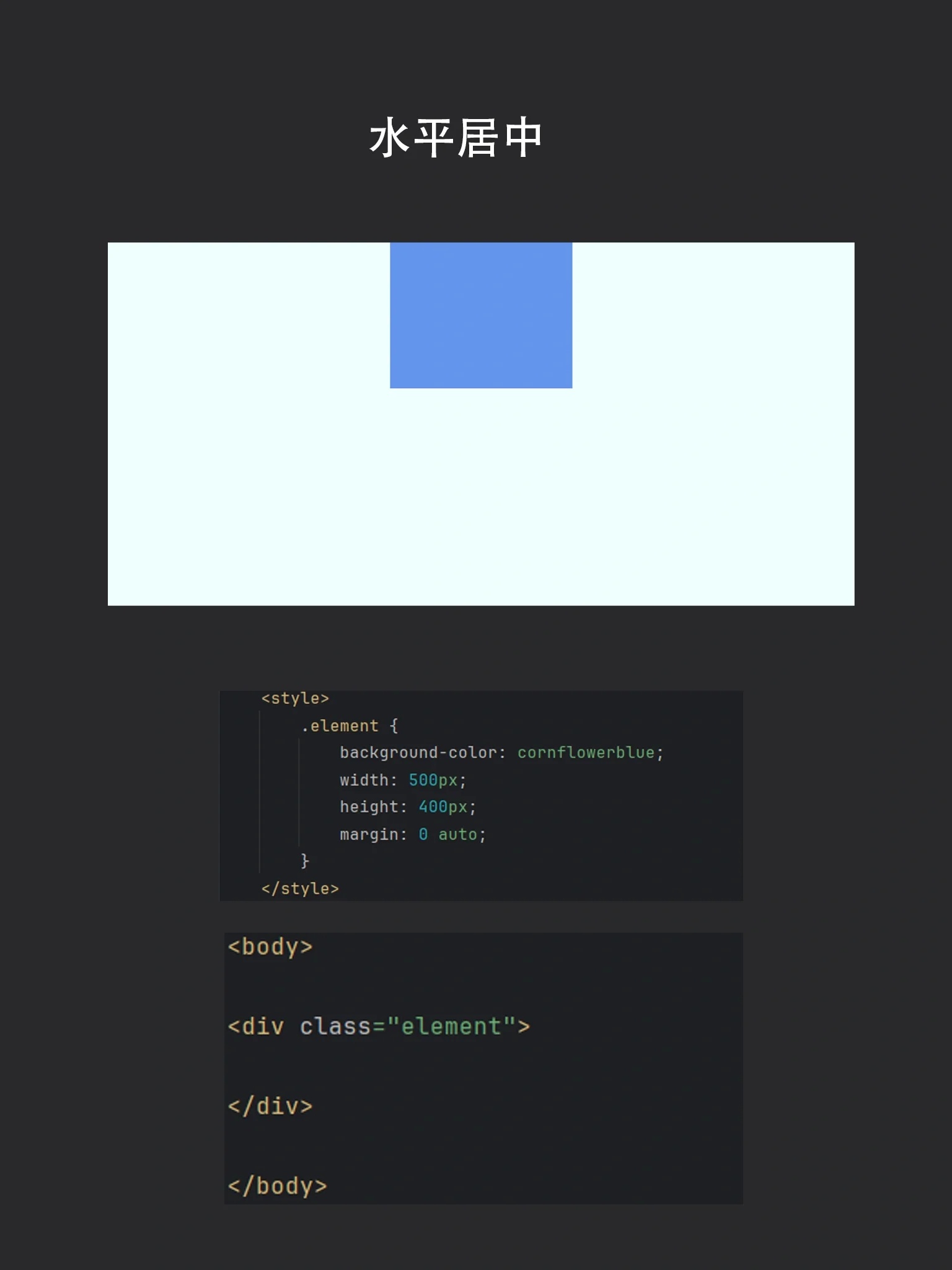
Margin Auto 自动边距
适用于块级元素的水平居中。
<div class="box">水平居中内容</div>
<style>
.box {
  width: 70%;
  margin: 0 auto;        /* 水平居中 */
  padding: 20px;
}
</style>
- 适用场景:单列布局、文章段落居中。
- 缺点:仅支持水平方向,需固定或百分比宽度。
文本居中(Text-Align)
针对行内元素或文本内容。
<div class="text-center">
  <span>这段文字会居中</span>
</div>
<style>
.text-center {
  text-align: center;
}
</style>
- 适用场景:段落文字、按钮、行内元素。
- 注意:仅影响行内内容,需配合其他方式垂直居中。
响应式优化技巧
- 移动优先设计:
使用媒体查询(@media)调整不同屏幕下的居中策略:@media (max-width: 768px) { .content { width: 95%; } } - 相对单位:
使用 、vw、vh替代固定像素值,如width: 90vw;。 - 图片居中:
通过max-width: 100%; height: auto;防止图片溢出。
最佳实践建议
- 优先选择 Flexbox/Grid:现代浏览器支持良好,代码更易维护。
- 测试多设备:使用 Chrome 开发者工具的 Device Toolbar 模拟不同分辨率。
- 避免过时方法:如表格布局(
display: table)不推荐用于响应式场景。
引用说明:
本文参考 MDN Web Docs 和 W3C 标准,代码经过主流浏览器测试。