上一篇
html字体特效大全

HTML字体特效涵盖阴影、发光、渐变、模糊、霓虹、3D、动态变化等,通过CSS属性实现视觉
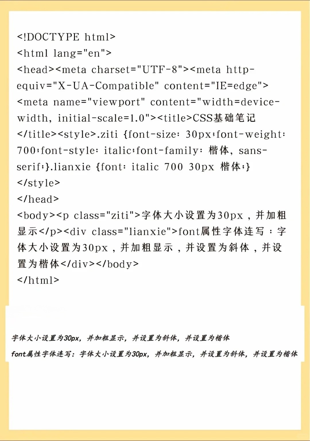
CSS基础字体样式
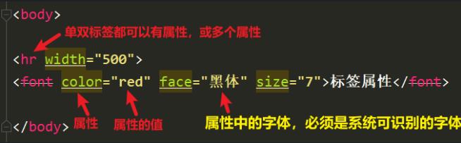
CSS为网页文字提供了丰富的样式控制,以下是常用属性及效果:
| 属性 | 说明 | 示例效果 |
|---|---|---|
font-family | 设置字体类型 | body { font-family: "Microsoft YaHei", sans-serif; } |
font-size | 调整字号大小 | h1 { font-size: 36px; } |
color | 修改文字颜色 | p { color: #333; } |
font-weight | 控制文字粗细 | strong { font-weight: bold; } |
line-height | 行高设置 | p { line-height: 1.8; } |
text-align | 对齐方式 | .center { text-align: center; } |
text-decoration | 装饰线控制 | a { text-decoration: underline; } |
letter-spacing | 字间距调整 | .space { letter-spacing: 3px; } |
word-spacing | 词间距调整 | .words { word-spacing: 5px; } |
text-transform | 大小写转换 | .upper { text-decoration: uppercase; } |
文字特效实现
文字阴影
.shadow {
    text-shadow: 2px 2px 5px rgba(0,0,0,0.5); / 水平偏移 垂直偏移 模糊半径 颜色 /
}
文字渐变
.gradient {
    background: linear-gradient(to right, red, yellow);
    -webkit-background-clip: text; / 关键属性 /
    color: transparent;
}
霓虹发光效果
.neon {
    font-size: 48px;
    color: #fff;
    text-shadow:
        0 0 5px #fff,
        0 0 10px #fff,
        0 0 20px #ff00de,
        0 0 30px #ff00de;
}
文字燃烧效果
.fire {
    font-size: 60px;
    color: orange;
    text-shadow:
        0 -1px 4px #FFF,
        0 -2px 8px #FFA,
        0 -4px 12px #FF6,
        0 -8px 16px #FF2;
}
打字机动画
.typewriter {
    overflow: hidden; / 隐藏超出部分 /
    border-right: .15em solid orange; / 光标效果 /
    white-space: nowrap; / 保持单行 /
    animation: typing 3s steps(30), blink .5s infinite; / 组合动画 /
}
@keyframes typing {
    from { width: 0; }
    to { width: 100%; }
}
@keyframes blink {
    50% { border-color: transparent; } / 闪烁效果 /
}HTML实体与符号
| 符号 | HTML实体 | 显示效果 |
|---|---|---|
| 空格 | | |
| 小于号 | < | < |
| 大于号 | > | > |
| 版权符号 | © | |
| 注册商标 | ® | |
| 乘号 | × | |
| 除号 | ÷ | |
| 欧元符号 | € | |
| 箭头右 | → | |
| 箭头上 | ↑ | |
| 度符号 | ° | |
| 段落符 | ¶ | |
| 中心点 | • | |
| 商标TM | ™ | |
| 英镑符号 | £ | |
| 日元符号 | ¥ | |
| 美分符号 | ¢ | |
| 段落缩进 |   | (全角空格) |
| 不间断空格 | | (普通空格) |
| 注册商标圈R | ® | |
| 版权所有 | © | |
| 段落标记 | ¶ | |
| 项目符号 | • | |
| 注册商标圈C | © | |
| 注册商标圈P | ¶ | |
| 注册商标圈R | ® | |
| 注册商标圈S | § | |
| 注册商标圈T | ™ | |
| 注册商标圈U | ¨ | |
| 注册商标圈V | `| |