上一篇
HTML5文字如何加虚线?css文字加下划线虚线样式
在 HTML5 和 CSS3 的开发环境中,实现文字下方的虚线效果主要依赖于 CSS 的 text-decoration 属性或更现代的 text-decoration-line 组合,虽然 HTML 本身没有直接定义“虚线文字”的标签,但通过语义化的 HTML 结构配合 CSS 样式,可以完美实现这一视觉效果。
以下是实现文字加虚线的几种主要方法、详细参数说明及最佳实践。
使用 text-decoration 属性(最常用)
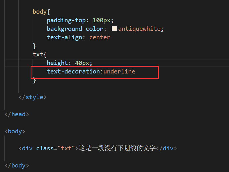
这是最简单且兼容性最好的方法。text-decoration 是一个简写属性,可以同时设置装饰线的类型、颜色和样式。
- 核心代码:text-decoration: underline dashed;
- 说明:
- underline:指定装饰线为下划线。
- dashed:指定线条样式为虚线。
使用独立的 text-decoration- 属性(CSS3 新特性)
CSS3 引入了更细粒度的控制属性,允许分别设置装饰线的类型、样式、颜色和粗细,这种方法在需要动态修改某一项属性时更加灵活。
| 属性名 | 作用 | 常用值示例 |
|---|---|---|
| text-decoration-line | 设置装饰线的位置 | underline, overline, line-through |
| text-decoration-style | 设置装饰线的样式 | solid, dashed, dotted, double |
| text-decoration-color | 设置装饰线的颜色 | #ff0000, red, transparent |
| text-decoration-thickness | 设置装饰线的粗细 | 2px, 1em, auto |
示例代码:
.modern-dashed-text { text-decoration-line: underline; text-decoration-style: dashed; text-decoration-color: #007bff; text-decoration-thickness: 1.5px; }
使用 border-bottom 模拟虚线(高级技巧)
在某些特殊场景下(如需要虚线与文字底部保持固定间距,或者虚线长度与文字不完全一致),使用 border-bottom 可能比 text-decoration 更可控。
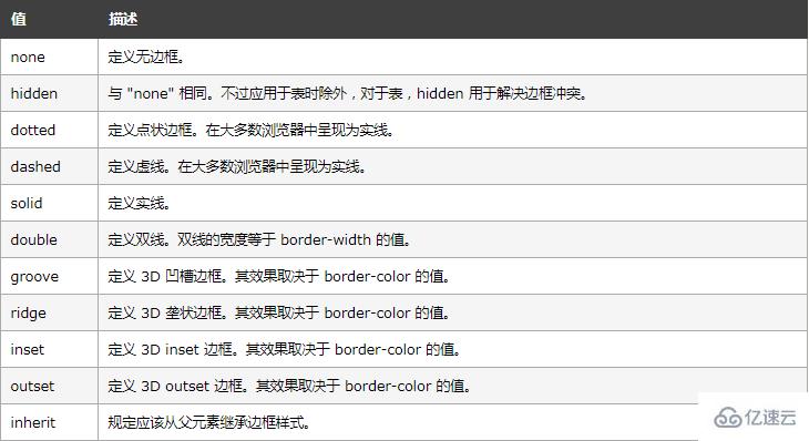
- 优点:可以精确控制虚线与文字的间距(通过 padding 或 margin),以及虚线的长度。
- 缺点:需要额外处理盒模型,且虚线样式在 border 中不如 text-decoration 语义化清晰。
.border-dashed-text { border-bottom: 2px dashed #333; padding-bottom: 5px; / 控制虚线与文字底部的距离 / display: inline-block; / 确保边框仅包裹文字 / }
各方法对比归纳
| 特性 | text-decoration | text-decoration- 系列 | border-bottom |
|---|---|---|---|
| 实现难度 | 低 | 中 | 中 |
| 语义化 | 高(明确表示装饰线) | 高 | 低(属于边框,非装饰) |
| 兼容性 | 极好(IE6+) | 良好(现代浏览器) | 极好 |
| 间距控制 | 困难(由字体决定) | 困难(由字体决定) | 容易(通过 padding/margin) |
| 推荐场景 | 通用下划线虚线 | 需要精细控制颜色/粗细 | 需要自定义间距或特殊布局 |
注意事项
- 浏览器兼容性:text-decoration-thickness 和 text-decoration-skip-ink 等属性在较旧的浏览器(如 IE)中不支持,如果需要兼容 IE,建议使用 text-decoration: underline dashed; 并依靠默认粗细。
- 字体差异:text-decoration 的虚线样式和间距受字体影响较大,不同字体的虚线间隔可能不一致。
- 可读性:虚线通常用于提示可点击链接、标注或强调,确保虚线与背景有足够的对比度,避免影响阅读。
相关问题与解答
问题 1:如何让虚线只出现在文字下方,而不影响行高?
解答:
text-decoration 产生的下划线通常会占用一定的行高空间,可能导致行间距变大,如果希望虚线不增加行高,可以使用 border-bottom 方法,并设置 line-height 为正常值,CSS3 的 text-decoration-thickness 允许你设置较小的厚度,从而减少对行高的影响,另一种技巧是使用 :after 伪元素,将虚线定位在文字下方,完全脱离文档流,这样就不会影响行高。
.no-line-height-impact { position: relative; } .no-line-height-impact::after { content: ''; position: absolute; bottom: -2px; / 调整位置 / left: 0; width: 100%; height: 2px; border-bottom: 2px dashed #333; }
问题 2:为什么在某些浏览器中,虚线的间隔看起来不均匀或太宽?
解答:
这通常是由于字体渲染引擎的差异造成的。text-decoration 的虚线样式是由浏览器根据当前字体和字号自动计算的,不同浏览器(Chrome, Firefox, Safari)和操作系统(Windows, macOS, Linux)的渲染结果可能不同。
解决方案:
- 使用 border-bottom:border-bottom 的虚线样式由 CSS 规范定义,跨平台一致性更好。
- 使用 SVG 背景:通过 background-image 引入一个微小的 SVG 虚线图案,可以精确控制虚线的间隔和样式,实现完全一致的视觉效果。
- 调整 text-decoration-skip-ink:虽然这主要影响是否跳过字母笔画,但有时也会影响整体视觉平衡,可以尝试设置为 none 或 auto 进行测试。