上一篇
html文字背景怎么设置?html文字背景颜色代码
# 2. 使用 `background` 简写属性 为了代码简洁,可以使用简写属性,同时设置颜色、图片等。 ```css .highlight { background: #ffeb3b; / 黄色背景 / }
常用背景相关属性表
| 属性名 | 描述 | 常用值示例 |
|---|---|---|
| background-color | 设置元素的背景颜色 | red, #fff, rgba(0,0,0,0.5) |
| background-image | 设置背景图片 | url('bg.jpg') |
| background-repeat | 背景图片是否重复 | no-repeat, repeat |
| background-size | 背景图片尺寸 | cover, contain, 100% 100% |
| padding | 内边距(重要) | 10px(增加文字与背景的间距) |
注意:为了让背景看起来美观,通常建议配合 padding(内边距)使用,否则文字会紧贴背景边缘,显得拥挤。
高级实现:文字本身的背景(Text Background)
有时我们希望背景色只覆盖在文字笔画下方,而不是整个矩形容器,这在现代CSS中可以通过 background-clip 属性实现。
核心属性:background-clip: text
该属性允许背景图像或颜色裁剪到文本内容的形状。
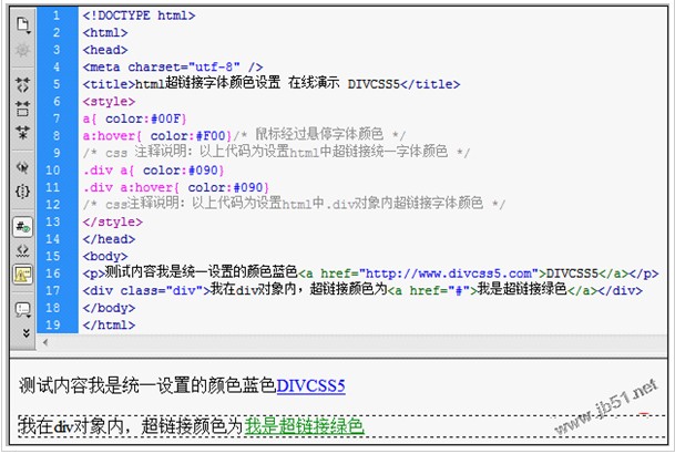
实现步骤:
- 设置文字颜色为透明(color: transparent)。
- 设置背景颜色或渐变。
- 使用 -webkit-background-clip: text(兼容WebKit内核浏览器)和 background-clip: text。
代码示例
<!DOCTYPE html> <html> <head> <style> .text-bg-effect { font-size: 48px; font-weight: bold; color: transparent; / 关键:文字颜色设为透明 / background: linear-gradient(to right, #ff0000, #0000ff); / 背景设为渐变 / -webkit-background-clip: text; / 兼容Chrome, Safari, Opera / background-clip: text; / 标准属性 / } </style> </head> <body> <h1 class="text-bg-effect">文字背景效果</h1> </body> </html>
兼容性说明
- 现代浏览器:Chrome, Firefox, Safari, Edge 均支持 background-clip: text。
- 旧版浏览器:可能需要添加 -webkit- 前缀。
- IE浏览器:完全不支持此特性。
其他相关背景技巧
半透明背景遮罩
在图片上显示文字时,常使用半透明背景提高可读性。
.overlay-text { background-color: rgba(0, 0, 0, 0.5); / 黑色,50%透明度 / color: white; padding: 10px; }
背景图片定位
如果背景是图片,可以使用 background-position 控制图片在容器中的位置。
常见问题与解答 (FAQ)
问题 1:为什么我的 background-clip: text 在 Firefox 中不生效?
解答:
在早期版本的 Firefox 中,background-clip: text 需要添加 -moz- 前缀才能生效,虽然现代 Firefox 版本已支持标准属性,但为了确保最大兼容性,建议在代码中同时添加前缀:
.element { color: transparent; background: linear-gradient(to right, red, blue); -webkit-background-clip: text; / Chrome, Safari, Opera / -moz-background-clip: text; / Firefox (旧版) / background-clip: text; / 标准 / }
请确保文字颜色 (color) 设置为 transparent 或 rgba(0,0,0,0),否则文字颜色会覆盖背景裁剪效果。
问题 2:如何给一段文字添加下划线风格的背景(类似荧光笔效果)?
解答:
可以使用 CSS 的 text-decoration 属性结合 text-decoration-color,或者更灵活地使用 background-color 配合 border-radius 和 padding 来模拟荧光笔效果。
使用背景色模拟(推荐,更灵活)
.highlight { background-color: #ffff00; / 黄色荧光笔效果 / padding: 2px 4px; border-radius: 4px; display: inline; / 保持行内元素特性 / }
使用 text-decoration(仅支持纯色)
.underline-bg { text-decoration: underline; text-decoration-color: #ffff00; text-decoration-style: wavy; / 可选:波浪线、直线等 / }
注意:text-decoration-color 的兼容性较好,但无法实现圆角或渐变背景,方法一”在实际项目中更为常用。