上一篇
html如何给按钮居中
HTML中,可以使用CSS将按钮居中,通过设置父元素的`text-align: center;
HTML中,将按钮居中可以通过多种方法实现,具体取决于你希望按钮在页面中的布局方式,以下是几种常见的方法,包括使用CSS的text-align、margin、Flexbox和Grid布局等。
使用 text-align: center
这是最简单的方法,适用于按钮所在的容器是块级元素(如<div>或<body>)的情况,通过将父元素的text-align属性设置为center,可以让其中的文本内容(包括按钮)水平居中。
<!DOCTYPE html> <html lang="en"> <head> <meta charset="UTF-8"> <meta name="viewport" content="width=device-width, initial-scale=1.0">Button Centering</title> <style> .container { text-align: center; margin-top: 50px; } </style> </head> <body> <div class="container"> <button>Click Me</button> </div> </body> </html>
使用 margin: auto
这种方法适用于按钮本身是块级元素或通过CSS设置为块级元素的情况,通过设置margin为auto,可以让按钮在其父元素中水平居中。
使用 Flexbox
Flexbox是一种强大的CSS布局工具,可以轻松地将按钮居中,通过将父元素设置为display: flex,并使用justify-content: center和align-items: center来水平和垂直居中按钮。
<!DOCTYPE html> <html lang="en"> <head> <meta charset="UTF-8"> <meta name="viewport" content="width=device-width, initial-scale=1.0">Button Centering</title> <style> .flex-container { display: flex; justify-content: center; align-items: center; height: 100vh; / 让容器占满整个视口高度 / } </style> </head> <body> <div class="flex-container"> <button>Click Me</button> </div> </body> </html>
使用 Grid Layout
CSS Grid布局也是一种强大的布局工具,可以轻松地将按钮居中,通过将父元素设置为display: grid,并使用place-items: center来水平和垂直居中按钮。
<!DOCTYPE html> <html lang="en"> <head> <meta charset="UTF-8"> <meta name="viewport" content="width=device-width, initial-scale=1.0">Button Centering</title> <style> .grid-container { display: grid; place-items: center; height: 100vh; / 让容器占满整个视口高度 / } </style> </head> <body> <div class="grid-container"> <button>Click Me</button> </div> </body> </html>
使用 position: absolute 和 transform
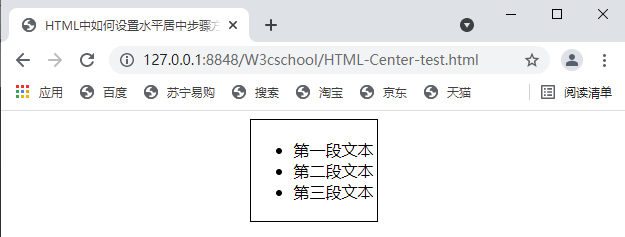
这种方法适用于需要将按钮在页面中精确定位的情况,通过将按钮设置为position: absolute,并使用left: 50%和transform: translateX(-50%)来水平居中按钮。
<!DOCTYPE html> <html lang="en"> <head> <meta charset="UTF-8"> <meta name="viewport" content="width=device-width, initial-scale=1.0">Button Centering</title> <style> .absolute-container { position: relative; height: 100vh; / 让容器占满整个视口高度 / } .centered-button { position: absolute; left: 50%; top: 50%; transform: translate(-50%, -50%); } </style> </head> <body> <div class="absolute-container"> <button class="centered-button">Click Me</button> </div> </body> </html>
使用表格布局
虽然表格布局不推荐用于现代网页设计,但在某些情况下,它仍然可以用来居中按钮,通过将按钮放在表格的单元格中,并设置表格的对齐方式为居中。
<!DOCTYPE html> <html lang="en"> <head> <meta charset="UTF-8"> <meta name="viewport" content="width=device-width, initial-scale=1.0">Button Centering</title> <style> table { width: 100%; height: 100vh; / 让表格占满整个视口高度 / } td { text-align: center; vertical-align: middle; } </style> </head> <body> <table> <tr> <td><button>Click Me</button></td> </tr> </table> </body> </html>
使用 calc() 和 margin
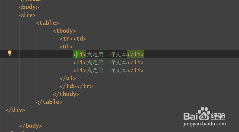
这种方法适用于需要动态计算按钮位置的情况,通过使用calc()函数,可以根据父元素的宽度动态计算按钮的margin值,从而实现居中。
<!DOCTYPE html> <html lang="en"> <head> <meta charset="UTF-8"> <meta name="viewport" content="width=device-width, initial-scale=1.0">Button Centering</title> <style> .dynamic-container { width: 100%; height: 100vh; / 让容器占满整个视口高度 / } .centered-button { display: block; margin: 0 auto; margin-top: calc(50% 25px); / 假设按钮高度为50px / } </style> </head> <body> <div class="dynamic-container"> <button class="centered-button">Click Me</button> </div> </body> </html>
使用 display: table 和 margin: auto
这种方法结合了表格布局和自动margin的特性,可以将按钮居中,通过将父元素设置为display: table,并将按钮设置为display: table-cell,然后使用margin: auto来居中按钮。
<!DOCTYPE html> <html lang="en"> <head> <meta charset="UTF-8"> <meta name="viewport" content="width=device-width, initial-scale=1.0">Button Centering</title> <style> .table-container { display: table; width: 100%; height: 100vh; / 让容器占满整个视口高度 / } .centered-button { display: table-cell; text-align: center; vertical-align: middle; } </style> </head> <body> <div class="table-container"> <button class="centered-button">Click Me</button> </div> </body> </html>
使用 line-height 和 vertical-align
这种方法适用于需要将按钮在文本内容中垂直居中的情况,通过设置父元素的line-height与按钮的高度相同,并使用vertical-align: middle来垂直居中按钮。
<!DOCTYPE html> <html lang="en"> <head> <meta charset="UTF-8"> <meta name="viewport" content="width=device-width, initial-scale=1.0">Button Centering</title> <style> .line-height-container { line-height: 50px; / 假设按钮高度为50px / text-align: center; height: 100vh; / 让容器占满整个视口高度 / } .centered-button { vertical-align: middle; } </style> </head> <body> <div class="line-height-container"> <button class="centered-button">Click Me</button> </div> </body> </html>
使用 display: inline-block 和 text-align: center
这种方法适用于按钮是内联元素的情况,通过将按钮设置为display: inline-block,并将父元素的text-align设置为center,可以水平居中按钮。
<!DOCTYPE html> <html lang="en"> <head> <meta charset="UTF-8"> <meta name="viewport" content="width=device-width, initial-scale=1.0">Button Centering</title> <style> .inline-block-container { text-align: center; height: 100vh; / 让容器占满整个视口高度 / } .centered-button { display: inline-block; margin-top: 50px; / 调整按钮的垂直位置 / } </style> </head> <body> <div class="inline-block-container"> <button class="centered-button">Click Me</button> </div> </body> </html>
相关问答FAQs
Q1: 如何在不同浏览器中确保按钮居中效果一致?
A1: 为了确保按钮在不同浏览器中的居中效果一致,建议使用标准的CSS布局方法,如Flexbox或Grid布局,这些方法在现代浏览器中都有良好的支持,并且能够提供一致的布局效果,可以使用CSS的reset或normalize样式表来消除不同浏览器之间的默认样式差异,如果需要兼容旧版浏览器,可以考虑使用text-align: center或margin: auto等传统方法,并通过测试确保在不同浏览器中的显示效果一致。
Q2: 如果按钮需要在响应式布局中居中,应该如何处理?
A2: 在响应式布局中,按钮的居中需要考虑不同屏幕尺寸下的显示效果,可以使用Flexbox或Grid布局,因为它们能够自动适应父元素的尺寸变化,使用Flexbox时,可以设置justify-content: center和align-items: center来确保按钮在水平和垂直方向上都居中,可以使用媒体查询(@media)来针对不同的屏幕尺寸调整按钮的样式,例如在小屏幕设备上调整按钮的大小或位置。