上一篇
HTML元素布局技巧揭秘,有哪些高效布局方法?
HTML元素布局是网页设计中非常重要的一个环节,它决定了网页的结构和美观,下面,我将详细介绍HTML元素如何布局。
布局方式
-
流动布局(Flexbox)
流动布局是现代网页设计中常用的布局方式之一,它通过CSS的display: flex;属性实现,可以让容器内的元素按照一定的顺序排列,并且具有弹性。
属性 说明 flexdirection 定义了主轴的方向,如row(默认水平方向)、column(垂直方向)等 justifycontent 定义了项目在主轴上的对齐方式,如flexstart(默认)、flexend、center、spacebetween、spacearound等 alignitems 定义了项目在交叉轴上如何对齐,如flexstart、flexend、center、stretch等 aligncontent 定义了多根轴线的对齐方式,如flexstart、flexend、center、spacebetween、spacearound、stretch等 -
栅格布局(Grid)
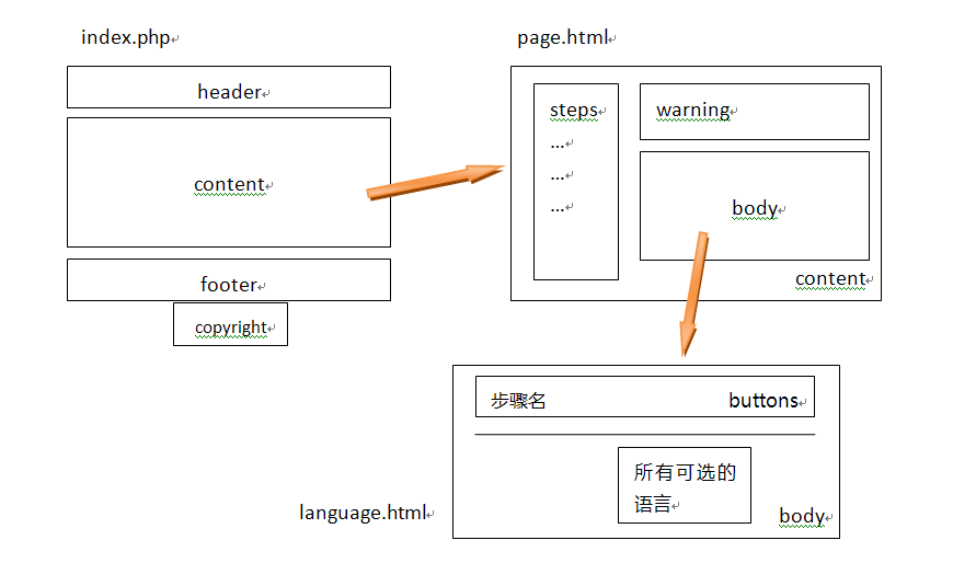
栅格布局是另一种常用的布局方式,它将容器划分为多个单元格,每个单元格都可以放置元素,CSS的display: grid;属性可以用来创建一个栅格布局。
属性 说明 gridtemplatecolumns 定义了列的尺寸和数量,如100px 200px 300px、1fr 2fr等 gridtemplaterows 定义了行的尺寸和数量,如100px 200px、1fr等 gridgap 定义了单元格之间的间隔 justifycontent 定义了项目在交叉轴上的对齐方式,如start、end、center等 aligncontent 定义了多根轴线的对齐方式,如start、end、center等 -
定位布局(Positioning)
定位布局是通过CSS的position属性实现的,它可以让元素相对于其正常位置进行定位。
属性 说明 position 设置元素的定位方式,如static(默认)、relative、absolute、fixed等 top 设置元素相对于其包含块的顶部距离 right 设置元素相对于其包含块的右侧距离 bottom 设置元素相对于其包含块的底部距离 left 设置元素相对于其包含块的左侧距离
实例
以下是一个使用Flexbox布局的实例:
<!DOCTYPE html> <html lang="en"> <head> <meta charset="UTF8"> <meta name="viewport" content="width=devicewidth, initialscale=1.0">Flexbox Layout Example</title> <style> .container { display: flex; justifycontent: center; alignitems: center; height: 200px; backgroundcolor: #f0f0f0; } .item { width: 100px; height: 100px; backgroundcolor: #007bff; margin: 10px; } </style> </head> <body> <div class="container"> <div class="item"></div> <div class="item"></div> <div class="item"></div> </div> </body> </html>
在这个例子中,.container元素使用Flexbox布局,三个.item元素被水平居中地放置在容器中。
FAQs
Q1:如何使用Grid布局创建一个3行4列的表格?
A1: 使用Grid布局创建表格非常简单,以下是一个示例代码:
<!DOCTYPE html> <html lang="en"> <head> <meta charset="UTF8"> <meta name="viewport" content="width=devicewidth, initialscale=1.0">Grid Table Example</title> <style> .table { display: grid; gridtemplatecolumns: repeat(4, 1fr); gridgap: 10px; } .cell { padding: 10px; backgroundcolor: #f0f0f0; border: 1px solid #ccc; } </style> </head> <body> <div class="table"> <div class="cell">Cell 1</div> <div class="cell">Cell 2</div> <div class="cell">Cell 3</div> <div class="cell">Cell 4</div> <div class="cell">Cell 5</div> <div class="cell">Cell 6</div> <div class="cell">Cell 7</div> <div class="cell">Cell 8</div> <div class="cell">Cell 9</div> <div class="cell">Cell 10</div> <div class="cell">Cell 11</div> <div class="cell">Cell 12</div> </div> </body> </html>
在这个例子中,.table元素使用Grid布局,并设置了4个列,每个.cell元素代表一个单元格。
Q2:如何使用定位布局将一个元素固定在页面顶部?
A2: 使用定位布局将元素固定在页面顶部非常简单,以下是一个示例代码:
<!DOCTYPE html> <html lang="en"> <head> <meta charset="UTF8"> <meta name="viewport" content="width=devicewidth, initialscale=1.0">Positioning Example</title> <style> .fixedelement { position: fixed; top: 0; left: 0; width: 100%; backgroundcolor: #007bff; color: #fff; padding: 10px; boxshadow: 0 2px 4px rgba(0, 0, 0, 0.1); } </style> </head> <body> <div class="fixedelement">Fixed Element</div> <div style="height: 2000px;">Scrollable Content</div> </body> </html>
在这个例子中,.fixedelement元素使用定位布局,并设置了position: fixed;、top: 0;和left: 0;属性,使其固定在页面顶部。