上一篇
HTML网页居中显示的多种方法与技巧探讨?
在HTML中,让网页内容居中是一种常见的布局需求,以下是一些常用的方法来实现网页内容的水平居中和垂直居中。
水平居中
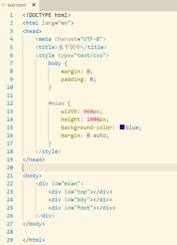
使用CSS的margin属性
.centered { margin: 0 auto; }
这种方法适用于单行文本或单元素居中。
使用Flexbox布局
.container { display: flex; justifycontent: center; }
这种方法可以轻松地对多个元素进行居中。
使用Grid布局
.container { display: grid; placeitems: center; }
Grid布局提供了一种更强大的方式来控制元素的位置。
使用绝对定位和transform
.centered { position: absolute; left: 50%; transform: translateX(50%); }
这种方法适用于需要绝对定位的元素。
垂直居中
使用CSS的margin属性
.centered { margin: auto 0; height: 200px; /* 高度 */ }
这种方法适用于单行文本或单元素居中。
使用Flexbox布局
.container { display: flex; alignitems: center; height: 200px; /* 高度 */ }
这种方法可以轻松地对多个元素进行垂直居中。
使用Grid布局
.container { display: grid; placeitems: center; height: 200px; /* 高度 */ }
Grid布局提供了一种更强大的方式来控制元素的位置。
使用绝对定位和transform
.centered { position: absolute; top: 50%; transform: translateY(50%); }
这种方法适用于需要绝对定位的元素。
混合使用水平居中和垂直居中
要同时实现水平和垂直居中,可以使用以下方法:
.container { display: flex; justifycontent: center; alignitems: center; height: 200px; /* 高度 */ }
或者使用Grid布局:

.container { display: grid; placeitems: center; height: 200px; /* 高度 */ }
示例代码
以下是一个简单的HTML和CSS示例,演示了如何使用Flexbox布局来实现水平和垂直居中:
<!DOCTYPE html> <html lang="en"> <head> <meta charset="UTF8"> <meta name="viewport" content="width=devicewidth, initialscale=1.0">Centered Content</title> <style> .container { display: flex; justifycontent: center; alignitems: center; height: 200px; backgroundcolor: #f0f0f0; } .centered { backgroundcolor: #ff0000; padding: 20px; } </style> </head> <body> <div class="container"> <div class="centered">Centered Content</div> </div> </body> </html>
FAQs
Q1:如何让一个div元素在另一个div元素中居中?
A1: 您可以使用Flexbox布局或Grid布局来实现,以下是一个使用Flexbox布局的示例:
.parent { display: flex; justifycontent: center; alignitems: center; height: 200px; backgroundcolor: #f0f0f0; } .child { backgroundcolor: #ff0000; padding: 20px; }
Q2:如何让一个图片在另一个div元素中居中?
A2: 您可以使用Flexbox布局或Grid布局来实现,以下是一个使用Flexbox布局的示例:
.container { display: flex; justifycontent: center; alignitems: center; height: 200px; backgroundcolor: #f0f0f0; } .image { width: 100px; height: 100px; backgroundimage: url('image.jpg'); backgroundsize: cover; }
示例仅供参考,您可以根据实际需求进行调整。