上一篇
如何设置框架的宽度html
HTML中,可以通过CSS 设置框架的宽度,使用内联样式:` ,或在CSS文件中定义:.my-div { width: 50%;
HTML中设置框架的宽度有多种方法,具体取决于你使用的框架类型以及你希望实现的效果,以下是几种常见的方法:
使用<iframe>标签设置宽度
<iframe>标签用于在网页中嵌入另一个HTML页面,你可以通过width和height属性来设置框架的宽度和高度。
<!DOCTYPE html> <html lang="en"> <head> <meta charset="UTF-8"> <meta name="viewport" content="width=device-width, initial-scale=1.0">Iframe Example</title> </head> <body> <iframe src="https://www.example.com" width="600" height="400"></iframe> </body> </html>
在这个例子中,<iframe>的宽度被设置为600像素,高度为400像素,你也可以使用百分比来设置宽度,使其相对于父元素的宽度进行调整。
<iframe src="https://www.example.com" width="100%" height="400"></iframe>
使用CSS设置宽度
你也可以通过CSS来设置<iframe>的宽度,这种方法更加灵活,因为你可以使用媒体查询、响应式设计等技术来适应不同的屏幕尺寸。
<!DOCTYPE html> <html lang="en"> <head> <meta charset="UTF-8"> <meta name="viewport" content="width=device-width, initial-scale=1.0">CSS Iframe Example</title> <style> .responsive-iframe { width: 100%; height: 400px; border: none; } </style> </head> <body> <iframe src="https://www.example.com" class="responsive-iframe"></iframe> </body> </html>
在这个例子中,.responsive-iframe类的宽度被设置为100%,这意味着它会随着父元素的宽度自动调整。
使用表格布局设置宽度
如果你希望将多个框架并排放置,可以使用表格布局,通过<table>、<tr>和<td>标签,你可以精确控制每个框架的宽度。
<!DOCTYPE html> <html lang="en"> <head> <meta charset="UTF-8"> <meta name="viewport" content="width=device-width, initial-scale=1.0">Table Layout Example</title> <style> table { width: 100%; border-collapse: collapse; } td { border: 1px solid #000; text-align: center; } iframe { width: 100%; height: 400px; border: none; } </style> </head> <body> <table> <tr> <td><iframe src="https://www.example.com"></iframe></td> <td><iframe src="https://www.anotherexample.com"></iframe></td> </tr> </table> </body> </html>
在这个例子中,表格被设置为100%的宽度,并且每个单元格中的<iframe>也设置为100%的宽度,这样它们会均匀分布在表格中。

使用Flexbox或Grid布局设置宽度
现代CSS提供了Flexbox和Grid布局,这些布局方式更加灵活和强大,适合复杂的页面布局。
Flexbox示例:
<!DOCTYPE html> <html lang="en"> <head> <meta charset="UTF-8"> <meta name="viewport" content="width=device-width, initial-scale=1.0">Flexbox Example</title> <style> .flex-container { display: flex; width: 100%; } .flex-item { flex: 1; margin: 10px; } iframe { width: 100%; height: 400px; border: none; } </style> </head> <body> <div class="flex-container"> <div class="flex-item"><iframe src="https://www.example.com"></iframe></div> <div class="flex-item"><iframe src="https://www.anotherexample.com"></iframe></div> </div> </body> </html>
在这个例子中,.flex-container被设置为Flex容器,.flex-item被设置为Flex项目,每个项目的宽度会自动调整以填充容器。
Grid示例:
<!DOCTYPE html> <html lang="en"> <head> <meta charset="UTF-8"> <meta name="viewport" content="width=device-width, initial-scale=1.0">Grid Example</title> <style> .grid-container { display: grid; grid-template-columns: repeat(2, 1fr); gap: 10px; width: 100%; } iframe { width: 100%; height: 400px; border: none; } </style> </head> <body> <div class="grid-container"> <iframe src="https://www.example.com"></iframe> <iframe src="https://www.anotherexample.com"></iframe> </div> </body> </html>
在这个例子中,.grid-container被设置为Grid容器,grid-template-columns属性定义了两列,每列的宽度为1fr(即均分容器宽度)。
响应式设计中的宽度设置
在响应式设计中,你可能需要根据屏幕尺寸动态调整框架的宽度,你可以使用媒体查询来实现这一点。
<!DOCTYPE html> <html lang="en"> <head> <meta charset="UTF-8"> <meta name="viewport" content="width=device-width, initial-scale=1.0">Responsive Example</title> <style> .responsive-iframe { width: 100%; height: 400px; border: none; } @media (max-width: 768px) { .responsive-iframe { height: 300px; } } </style> </head> <body> <iframe src="https://www.example.com" class="responsive-iframe"></iframe> </body> </html>
在这个例子中,当屏幕宽度小于768像素时,.responsive-iframe的高度会被调整为300像素。

使用JavaScript动态设置宽度
在某些情况下,你可能需要在运行时动态设置框架的宽度,你可以使用JavaScript来实现这一点。
<!DOCTYPE html> <html lang="en"> <head> <meta charset="UTF-8"> <meta name="viewport" content="width=device-width, initial-scale=1.0">JavaScript Example</title> <style> #dynamic-iframe { height: 400px; border: none; } </style> </head> <body> <iframe id="dynamic-iframe" src="https://www.example.com"></iframe> <button onclick="setIframeWidth()">Set Width to 800px</button> <script> function setIframeWidth() { var iframe = document.getElementById('dynamic-iframe'); iframe.style.width = '800px'; } </script> </body> </html>
在这个例子中,点击按钮后,<iframe>的宽度会被设置为800像素。
使用Bootstrap框架设置宽度
如果你使用了Bootstrap框架,你可以利用其内置的类来快速设置框架的宽度。
<!DOCTYPE html> <html lang="en"> <head> <meta charset="UTF-8"> <meta name="viewport" content="width=device-width, initial-scale=1.0">Bootstrap Example</title> <link href="https://stackpath.bootstrapcdn.com/bootstrap/4.5.2/css/bootstrap.min.css" rel="stylesheet"> </head> <body> <div class="container"> <iframe src="https://www.example.com" class="w-100"></iframe> </div> </body> </html>
在这个例子中,w-100类使<iframe>的宽度为100%。
使用自定义CSS变量设置宽度
你还可以使用CSS变量来定义宽度,这样可以在整个项目中保持一致性。
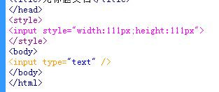
<!DOCTYPE html> <html lang="en"> <head> <meta charset="UTF-8"> <meta name="viewport" content="width=device-width, initial-scale=1.0">CSS Variables Example</title> <style> :root { --iframe-width: 600px; } .custom-iframe { width: var(--iframe-width); height: 400px; border: none; } </style> </head> <body> <iframe src="https://www.example.com" class="custom-iframe"></iframe> </body> </html>
在这个例子中,--iframe-width变量被定义为600像素,.custom-iframe类使用这个变量来设置宽度。
使用相对单位设置宽度
除了像素,你还可以使用相对单位如em、rem、vw、vh等来设置宽度,这些单位可以使你的设计更加灵活和适应性强。
<!DOCTYPE html> <html lang="en"> <head> <meta charset="UTF-8"> <meta name="viewport" content="width=device-width, initial-scale=1.0">Relative Units Example</title> <style> .relative-iframe { width: 50vw; / 50% of the viewport width / height: 400px; border: none; } </style> </head> <body> <iframe src="https://www.example.com" class="relative-iframe"></iframe> </body> </html>
在这个例子中,.relative-iframe的宽度被设置为视口宽度的50%。
使用CSS Grid和Flexbox结合设置宽度
在某些复杂的布局中,你可以结合使用CSS Grid和Flexbox来设置框架的宽度。
<!DOCTYPE html> <html lang="en"> <head> <meta charset="UTF-8"> <meta name="viewport" content="width=device-width, initial-scale=1.0">Combined Layout Example</title> <style> .grid-container { display: grid; grid-template-columns: repeat(2, 1fr); gap: 10px; width: 100%; } .flex-container { display: flex; flex-direction: column; } .flex-item { margin: 10px 0; } iframe { width: 100%; height: 200px; border: none; } </style> </head> <body> <div class="grid-container"> <div class="flex-container"> <div class="flex-item"><iframe src="https://www.example.com"></iframe></div> <div class="flex-item"><iframe src="https://www.anotherexample.com"></iframe></div> </div> <div class="flex-container"> <div class="flex-item"><iframe src="https://www.example.com"></iframe></div> <div class="flex-item"><iframe src="https://www.anotherexample.com"></iframe></div> </div> </div> </body> </html>
在这个例子中,.grid-container使用Grid布局,而.flex-container使用Flexbox布局,两者结合实现了复杂的布局结构。
FAQs:
Q1: 如何使<iframe>的宽度自适应父元素的宽度?
A1: 你可以通过设置<iframe>的宽度为百分比(如width: 100%)或使用CSS类来实现自适应宽度,确保父元素的宽度也是可调整的,例如使用width: 100%或Flexbox/Grid布局。
Q2: 如何在移动设备上优化<iframe>的显示效果?
A2: 你可以使用媒体查询来检测屏幕尺寸,并根据需要调整<iframe>的宽度和高度。