上一篇
html如何将表格分两列
HTML中,使用“标签并通过CSS设置表格宽度为50%或
使用HTML表格的基本结构
HTML表格由<table>、<tr>(行)、<td>(单元格)等标签组成,要将表格分为两列,只需在每一行中定义两个单元格即可。
示例代码:
<table border="1"> <tr> <th>列1标题</th> <th>列2标题</th> </tr> <tr> <td>数据1</td> <td>数据2</td> </tr> <tr> <td>数据3</td> <td>数据4</td> </tr> </table>
解释:
- <table>:定义表格。
- <tr>:定义一行。
- <th>:定义表头单元格。
- <td>:定义数据单元格。
- border="1":为表格添加边框,方便查看。
使用CSS控制表格布局
如果需要更灵活的布局,可以使用CSS来控制表格的样式和分列方式,可以使用CSS Grid或Flexbox来实现两列布局。
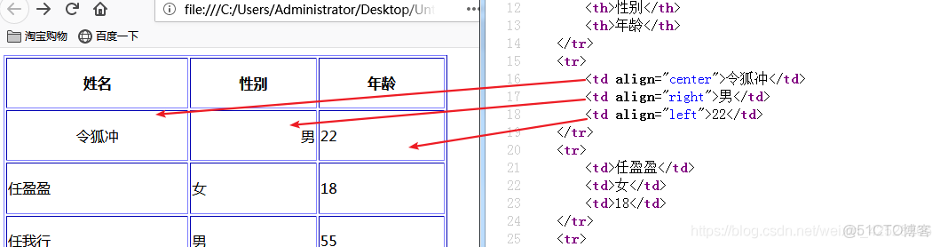
示例代码(使用CSS Grid):
<style> .two-column-table { display: grid; grid-template-columns: 1fr 1fr; / 定义两列,每列宽度相等 / gap: 10px; / 列间距 / } .two-column-table div { background-color: #f2f2f2; padding: 10px; border: 1px solid #ccc; } </style> <div class="two-column-table"> <div>数据1</div> <div>数据2</div> <div>数据3</div> <div>数据4</div> </div>
解释:
- display: grid;:将元素设置为Grid布局。
- grid-template-columns: 1fr 1fr;:定义两列,每列宽度相等。
- gap: 10px;:设置列间距。
- div:用于模拟表格的单元格。
使用HTML和CSS结合实现两列布局
如果希望表格的两列内容不同,可以使用HTML和CSS结合的方式实现,左侧显示图片,右侧显示文字。
示例代码:
<style> .two-column { display: flex; border: 1px solid #ccc; padding: 10px; } .two-column .left { width: 50%; text-align: center; } .two-column .right { width: 50%; padding: 10px; } </style> <div class="two-column"> <div class="left"> <img src="image.jpg" alt="图片" style="max-width:100%;"> </div> <div class="right"> <h3>标题</h3> <p>这里是文字描述内容。</p> </div> </div>
解释:
- display: flex;:使用Flexbox布局。
- .left和.right:分别定义左侧和右侧的样式。
- width: 50%;:每列占50%的宽度。
使用HTML表格的colspan和rowspan属性
如果需要在表格中合并单元格,可以使用colspan(合并列)和rowspan(合并行)属性,将表格分为两列,其中一行跨两列。
示例代码:
<table border="1"> <tr> <th colspan="2">合并两列的标题</th> </tr> <tr> <td>数据1</td> <td>数据2</td> </tr> </table>
解释:
- colspan="2":将表头单元格跨两列。
响应式两列布局
如果需要在不同设备上自适应两列布局,可以使用媒体查询(Media Queries)和百分比宽度。
示例代码:
<style> .responsive-table { width: 100%; display: table; border-collapse: collapse; } .responsive-table .row { display: table-row; } .responsive-table .cell { display: table-cell; padding: 10px; border: 1px solid #ccc; } @media (max-width: 600px) { .responsive-table .cell { display: block; width: 100%; } } </style> <div class="responsive-table"> <div class="row"> <div class="cell">数据1</div> <div class="cell">数据2</div> </div> <div class="row"> <div class="cell">数据3</div> <div class="cell">数据4</div> </div> </div>
解释:
- @media (max-width: 600px):在屏幕宽度小于600px时,将单元格改为块级元素,实现响应式布局。
使用Bootstrap框架实现两列布局
如果使用Bootstrap框架,可以快速实现两列布局,Bootstrap提供了预定义的类,如col-md-6,表示在中等及以上屏幕中占50%宽度。
示例代码:
<link rel="stylesheet" href="https://stackpath.bootstrapcdn.com/bootstrap/4.5.2/css/bootstrap.min.css"> <div class="container"> <div class="row"> <div class="col-md-6"> <h3>左侧内容</h3> <p>这里是左侧的文字内容。</p> </div> <div class="col-md-6"> <h3>右侧内容</h3> <p>这里是右侧的文字内容。</p> </div> </div> </div>
解释:
- container:Bootstrap的容器类,用于居中内容。
- row:定义一行。
- col-md-6:在中等及以上屏幕中占50%宽度。
常见问题及解决方案
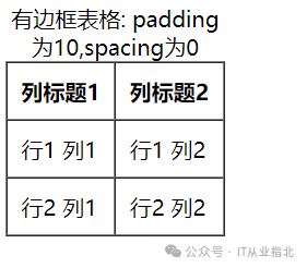
问题1:表格两列内容不对齐怎么办?
解决方案:检查表格的HTML结构,确保每行的<td>数量一致,如果使用了CSS布局(如Flexbox或Grid),确保样式正确应用。
问题2:如何让表格的两列在不同设备上自适应?
解决方案:使用响应式设计技术,如媒体查询或Bootstrap的网格系统,确保表格在不同屏幕宽度下自动调整布局。
FAQs
问题1:如何在HTML表格中合并单元格?
解答:可以使用colspan(合并列)和rowspan(合并行)属性。
<table border="1"> <tr> <th rowspan="2">合并两行的标题</th> <th>列1</th> <th>列2</th> </tr> <tr> <td>数据1</td> <td>数据2</td> </tr> </table>
问题2:如何让表格的两列内容垂直居中?
解答:可以使用CSS的vertical-align: middle;属性。
<style> table { width: 100%; border-collapse: collapse; } td, th { vertical-align: middle; text-align: center; padding: 10px; border: 1px solid #ccc; }