上一篇
html中ul如何水平居中显示
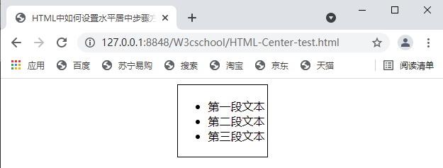
HTML 中,通过将 ul 元素的 margin 设置为 0 auto
在HTML中,ul标签用于创建无序列表,要使ul水平居中显示,可以通过多种CSS方法来实现,以下是几种常用的方法及其详细解释:
使用text-align属性
基本原理
通过将包含ul的父元素的text-align属性设置为center,可以实现ul的水平居中,这种方法适用于inline或inline-block类型的元素。
示例代码
<!DOCTYPE html> <html lang="en"> <head> <meta charset="UTF-8">Text-Align Center</title> <style> .container { text-align: center; } ul { display: inline-block; padding: 0; margin: 0; list-style: none; } li { display: inline-block; margin: 0 10px; } </style> </head> <body> <div class="container"> <ul> <li>Item 1</li> <li>Item 2</li> <li>Item 3</li> </ul> </div> </body> </html>
优缺点
优点:简单易懂,快速实现。
缺点:ul必须设置为inline-block,否则无法生效;对复杂布局支持有限。
使用flexbox布局
基本原理
flexbox布局是一种现代的CSS布局方式,可以轻松实现水平和垂直居中,通过设置父元素为display: flex,并使用justify-content: center实现子元素水平居中。
示例代码
<!DOCTYPE html> <html lang="en"> <head> <meta charset="UTF-8">Flexbox Center</title> <style> .container { display: flex; justify-content: center; height: 100vh; / 使容器全屏 / } ul { list-style: none; padding: 0; margin: 0; } li { margin: 5px 0; } </style> </head> <body> <div class="container"> <ul> <li>Item 1</li> <li>Item 2</li> <li>Item 3</li> </ul> </div> </body> </html>
优缺点
优点:灵活强大,适用于复杂布局;可以轻松实现水平和垂直居中。
缺点:较老的浏览器可能不支持;需要更多的CSS代码。
使用margin自动对齐
基本原理
通过给ul设置margin: 0 auto,可以实现水平居中,这种方法适用于block级元素,但需要确保ul的宽度是已知的。
示例代码
<!DOCTYPE html> <html lang="en"> <head> <meta charset="UTF-8">Margin Auto Center</title> <style> ul { width: 200px; margin: 0 auto; padding: 0; list-style: none; } li { background-color: #f0f0f0; padding: 10px; margin: 5px 0; } </style> </head> <body> <ul> <li>Item 1</li> <li>Item 2</li> <li>Item 3</li> </ul> </body> </html>
优缺点
优点:简单易懂,适用于固定宽度的元素。
缺点:只适用于block级元素,且需要明确设置宽度。
使用grid布局
基本原理
grid布局是一种现代的CSS布局方式,通过设置父元素为display: grid,并使用justify-content: center和align-items: center实现子元素的水平居中。
示例代码
<!DOCTYPE html> <html lang="en"> <head> <meta charset="UTF-8">Grid Center</title> <style> .container { display: grid; place-items: center; / 水平和垂直居中 / height: 100vh; / 使容器全屏 / } ul { list-style: none; padding: 0; margin: 0; } li { margin: 5px 0; } </style> </head> <body> <div class="container"> <ul> <li>Item 1</li> <li>Item 2</li> <li>Item 3</li> </ul> </div> </body> </html>
优缺点
优点:适用于复杂布局,可以轻松实现水平和垂直居中。
缺点:较老的浏览器可能不支持;需要更多的CSS代码。
使用绝对定位
基本原理
通过设置ul的父元素为相对定位,并将ul设置为绝对定位,然后通过top、left、transform等属性来调整位置,实现居中。
示例代码
<!DOCTYPE html> <html lang="en"> <head> <meta charset="UTF-8">Absolute Positioning Center</title> <style> .container { position: relative; height: 100vh; / 使容器全屏 / } ul { position: absolute; top: 50%; left: 50%; transform: translate(-50%, -50%); / 水平和垂直居中 / list-style: none; padding: 0; margin: 0; } li { margin: 5px 0; } </style> </head> <body> <div class="container"> <ul> <li>Item 1</li> <li>Item 2</li> <li>Item 3</li> </ul> </div> </body> </html>
优缺点
优点:适用于已知容器大小的情况,可以实现精确定位。
缺点:需要明确设置父元素的位置和尺寸,且对响应式设计支持较差。
使用CSS特性(如display: table)
基本原理
通过将父元素设置为display: table,子元素设置为display: table-cell,并配合vertical-align属性来实现居中。
示例代码
<!DOCTYPE html> <html lang="en"> <head> <meta charset="UTF-8">Table Cell Center</title> <style> .container { display: table; width: 100%; height: 100vh; / 使容器全屏 / } .cell { display: table-cell; vertical-align: middle; / 垂直居中 / text-align: center; / 水平居中 / } ul { list-style: none; padding: 0; margin: 0; } li { margin: 5px 0; } </style> </head> <body> <div class="container"> <div class="cell"> <ul> <li>Item 1</li> <li>Item 2</li> <li>Item 3</li> </ul> </div> </div> </body> </html>
优缺点
优点:适用于特定场景,可以实现水平和垂直居中。