上一篇
在HTML中,块元素居中的具体实现方法有哪些?
在HTML中,要让块元素居中,可以使用多种方法,包括使用CSS的定位属性、flex布局或者grid布局,以下是一些常见的方法:
使用CSS定位属性
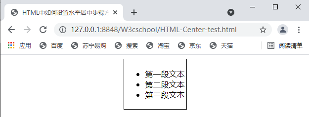
使用CSS的定位属性可以很容易地将块元素水平或垂直居中,以下是一个简单的例子:
<!DOCTYPE html> <html lang="en"> <head> <meta charset="UTF8"> <meta name="viewport" content="width=devicewidth, initialscale=1.0"> <style> .container { position: relative; width: 100%; height: 200px; backgroundcolor: #f3f3f3; } .centered { position: absolute; top: 50%; left: 50%; transform: translate(50%, 50%); width: 100px; height: 100px; backgroundcolor: #ff0000; } </style> </head> <body> <div class="container"> <div class="centered"></div> </div> </body> </html>
在这个例子中,.centered 类中的元素被设置为绝对定位,并通过top和left属性将其定位到容器的中心,使用transform: translate(50%, 50%); 来将元素向左和向上移动自身宽度的一半,从而实现居中。
使用Flex布局
Flex布局是现代CSS中非常流行的一种布局方式,它可以很容易地实现元素的水平或垂直居中。
<!DOCTYPE html> <html lang="en"> <head> <meta charset="UTF8"> <meta name="viewport" content="width=devicewidth, initialscale=1.0"> <style> .container { display: flex; justifycontent: center; alignitems: center; width: 100%; height: 200px; backgroundcolor: #f3f3f3; } .centered { width: 100px; height: 100px; backgroundcolor: #ff0000; } </style> </head> <body> <div class="container"> <div class="centered"></div> </div> </body> </html>
在这个例子中,.container 类使用display: flex; 来启用flex布局,并通过justifycontent: center; 和 alignitems: center; 属性来水平和垂直居中其子元素。
使用Grid布局
Grid布局是CSS中另一种强大的布局工具,它可以提供更复杂的布局结构,并且也可以用来居中元素。
<!DOCTYPE html> <html lang="en"> <head> <meta charset="UTF8"> <meta name="viewport" content="width=devicewidth, initialscale=1.0"> <style> .container { display: grid; placeitems: center; width: 100%; height: 200px; backgroundcolor: #f3f3f3; } .centered { width: 100px; height: 100px; backgroundcolor: #ff0000; } </style> </head> <body> <div class="container"> <div class="centered"></div> </div> </body> </html>
在这个例子中,.container 类使用display: grid; 来启用grid布局,并通过placeitems: center; 属性来同时水平和垂直居中其子元素。

FAQs
Q1:如何使用CSS的定位属性来水平居中一个块元素?
A1:要水平居中一个块元素,可以使用CSS的定位属性position: absolute;,并将left属性设置为50%,然后使用transform: translateX(50%);来将元素向右移动自身宽度的一半。
Q2:Flex布局和Grid布局哪个更适合居中元素?
A2:Flex布局和Grid布局都可以用来居中元素,选择哪个取决于你的具体需求,Flex布局更适合简单的布局,而Grid布局则更适合复杂的布局,如果你的布局相对简单,Flex布局可能是一个更好的选择,如果需要更复杂的布局结构,Grid布局可能更适合。