上一篇
HTML按钮美化技巧全解析,有哪些方法可以让按钮更吸引人?
美化HTML中的按钮可以通过多种方式实现,以下是一些常用的方法和技巧:
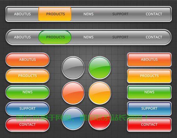
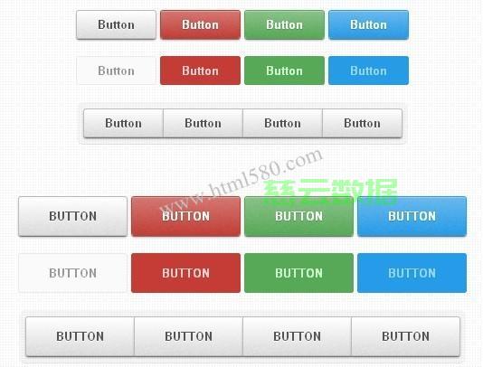
使用CSS样式
1 基本样式
button { padding: 10px 20px; fontsize: 16px; color: #fff; backgroundcolor: #007bff; border: none; borderradius: 5px; cursor: pointer; }
2 鼠标悬停效果
button:hover { backgroundcolor: #0056b3; }
3 交互效果
button:active { backgroundcolor: #004494; }
使用伪元素
1 添加阴影
button::after { content: ''; position: absolute; top: 0; left: 0; right: 0; bottom: 0; borderradius: 5px; backgroundcolor: rgba(0, 123, 255, 0.5); zindex: 1; }
2 添加边框
button::before { content: ''; position: absolute; top: 5px; left: 5px; right: 5px; bottom: 5px; border: 2px solid #007bff; zindex: 2; }
使用图标
1 添加图标
<button><i class="fa facheck"></i> Submit</button>
2 图标样式
button i { marginright: 10px; }
使用动画
1 添加动画
button { transition: backgroundcolor 0.3s ease; } button:hover { backgroundcolor: #0056b3; }
2 动画效果
button { animation: pulse 1s infinite; } @keyframes pulse { 0% { transform: scale(1); } 50% { transform: scale(1.1); } 100% { transform: scale(1); } }
使用响应式设计
1 响应式按钮
@media (maxwidth: 600px) { button { padding: 8px 16px; fontsize: 14px; } }
使用框架
1 Bootstrap按钮
<button class="btn btnprimary">Submit</button>
FAQs
Q1:如何让按钮在鼠标悬停时改变颜色?
A1: 在CSS中,你可以使用 hover 伪类来改变按钮在鼠标悬停时的颜色。
button:hover { backgroundcolor: #0056b3; }
Q2:如何让按钮在点击时产生阴影效果?
A2: 你可以使用伪元素 :after 来添加阴影效果。
button::after { content: ''; position: absolute; top: 0; left: 0; right: 0; bottom: 0; borderradius: 5px; backgroundcolor: rgba(0, 123, 255, 0.5); zindex: 1; }