上一篇
html 如何让标签在最底部
HT ML 标签固定在页面底部,可以使用 CSS 的 position: fixed; 属性,并将 bottom 设置为 0。,“`html,
HTML 如何让标签在最底部
在网页开发中,有时我们需要将特定的标签元素固定在页面的底部,无论页面内容多少,该元素始终处于页面的最下方,实现这一效果的方法有多种,下面将详细介绍几种常见的实现方式,并提供相应的代码示例和注意事项。
使用 CSS 定位属性
1 使用 position: fixed;
position: fixed; 可以将元素固定在浏览器窗口的特定位置,无论页面如何滚动,元素始终保持在该位置。
示例代码:
<!DOCTYPE html> <html lang="zh-CN"> <head> <meta charset="UTF-8">固定底部示例</title> <style> .fixed-bottom { position: fixed; bottom: 0; width: 100%; background-color: #f8f9fa; text-align: center; padding: 10px 0; box-shadow: 0 -2px 5px rgba(0,0,0,0.1); z-index: 1000; } body { margin: 0; padding-bottom: 50px; / 防止内容被固定元素遮挡 / } </style> </head> <body> <div class="content"> <p>这里是页面内容...</p> <!-更多内容 --> </div> <div class="fixed-bottom"> 版权所有 © 2023 公司名称 </div> </body> </html>
说明:
- .fixed-bottom 类通过 position: fixed; 和 bottom: 0; 将元素固定在页面底部。
- width: 100%; 确保元素宽度与页面一致。
- padding-bottom: 50px; 在 body 上添加下内边距,防止固定元素遮挡部分内容。
- z-index: 1000; 确保固定元素位于其他元素之上。
2 使用 position: absolute;
position: absolute; 可以将元素相对于其最近的定位祖先元素进行定位,如果希望元素始终位于页面底部,可以将其父元素设置为 position: relative; 并设置 bottom: 0;。
示例代码:
<!DOCTYPE html> <html lang="zh-CN"> <head> <meta charset="UTF-8">绝对定位底部示例</title> <style> .container { position: relative; min-height: 100vh; / 确保容器高度至少为视口高度 / padding-bottom: 50px; / 为底部元素留出空间 / } .absolute-bottom { position: absolute; bottom: 0; width: 100%; background-color: #f8f9fa; text-align: center; padding: 10px 0; box-shadow: 0 -2px 5px rgba(0,0,0,0.1); } </style> </head> <body> <div class="container"> <div class="content"> <p>这里是页面内容...</p> <!-更多内容 --> </div> <div class="absolute-bottom"> 版权所有 © 2023 公司名称 </div> </div> </body> </html>
说明:
- .container 类设置为 position: relative;,作为 .absolute-bottom 的定位上下文。
- min-height: 100vh; 确保容器高度至少为视口高度,防止内容不足时底部元素贴在底部。
- .absolute-bottom 通过 position: absolute; 和 bottom: 0; 定位在容器的底部。
- padding-bottom: 50px; 为底部元素留出空间,防止内容被遮挡。
使用 Flexbox 布局
Flexbox 是一种强大的布局模式,可以轻松地将元素放置在容器的特定位置,如底部。
示例代码:
<!DOCTYPE html> <html lang="zh-CN"> <head> <meta charset="UTF-8">Flexbox 底部示例</title> <style> .flex-container { display: flex; flex-direction: column; min-height: 100vh; / 确保容器高度至少为视口高度 / } .flex-content { flex: 1; / 允许内容区域扩展以填充剩余空间 / padding: 20px; } .flex-bottom { background-color: #f8f9fa; text-align: center; padding: 10px 0; box-shadow: 0 -2px 5px rgba(0,0,0,0.1); } </style> </head> <body> <div class="flex-container"> <div class="flex-content"> <p>这里是页面内容...</p> <!-更多内容 --> </div> <div class="flex-bottom"> 版权所有 © 2023 公司名称 </div> </div> </body> </html>
说明:
- .flex-container 使用 display: flex; 和 flex-direction: column; 创建一个垂直方向的弹性容器。
- min-height: 100vh; 确保容器高度至少为视口高度。
- .flex-content 设置 flex: 1;,使其占据剩余的空间。
- .flex-bottom 作为最后一个子元素,自然位于容器的底部。
使用 CSS Grid 布局
CSS Grid 是另一种现代布局方式,可以更灵活地控制元素的位置。
示例代码:
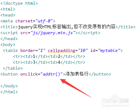
说明:
- .grid-container 使用 display: grid; 并定义 grid-template-rows: 1fr auto;,1fr 表示第一行占据剩余空间,auto 表示第二行根据内容自动调整高度。
- min-height: 100vh; 确保容器高度至少为视口高度。
- .grid-content 是主要内容区域。
- .grid-bottom 作为网格的最后一行,自然位于底部。
使用 JavaScript 动态调整
在某些情况下,可能需要使用 JavaScript 根据页面内容动态调整元素的位置,以确保其始终位于底部。
示例代码:
<!DOCTYPE html> <html lang="zh-CN"> <head> <meta charset="UTF-8">JavaScript 动态底部示例</title> <style> body { margin: 0; padding: 0; } .dynamic-bottom { background-color: #f8f9fa; text-align: center; padding: 10px 0; position: relative; box-shadow: 0 -2px 5px rgba(0,0,0,0.1); } </style> </head> <body> <div class="content"> <p>这里是页面内容...</p> <!-更多内容 --> </div> <div class="dynamic-bottom"> 版权所有 © 2023 公司名称 </div> <script> function adjustBottomPosition() { const bottomElement = document.querySelector('.dynamic-bottom'); const contentElement = document.querySelector('.content'); const windowHeight = window.innerHeight; const contentHeight = contentElement.offsetHeight; const scrollY = window.scrollY; const newBottomPosition = windowHeight (contentHeight scrollY) bottomElement.offsetHeight; bottomElement.style.top = `${newBottomPosition}px`; } window.addEventListener('load', adjustBottomPosition); window.addEventListener('resize', adjustBottomPosition); window.addEventListener('scroll', adjustBottomPosition); </script> </body> </html>
说明:
- .dynamic-bottom 元素初始设置为 position: relative;。
- JavaScript 函数 adjustBottomPosition 根据窗口高度、内容高度和滚动位置动态计算并设置 .dynamic-bottom 的 top 属性,使其始终位于页面底部。
- 事件监听器在页面加载、窗口大小调整和滚动时调用该函数,确保底部元素的位置始终正确。
注意: 这种方法相对复杂,且在内容动态变化时可能需要额外的处理,通常推荐使用 CSS 方法来实现固定底部效果。
响应式设计考虑
在实现底部固定或定位时,还需要考虑响应式设计,以确保在不同设备和屏幕尺寸下效果良好,以下是一些建议:
-
媒体查询: 使用媒体查询调整底部元素的样式,例如在移动设备上改变字体大小或布局。
@media (max-width: 768px) { .fixed-bottom { font-size: 14px; padding: 8px 0; } } -
流式布局: 确保底部元素在窄屏设备上不会超出屏幕宽度,可以使用百分比宽度或弹性单位。
-
隐藏或简化内容: 在极窄的屏幕上,可以考虑隐藏底部元素或仅显示必要的信息。
常见问题及解决方案
固定底部元素遮挡了部分内容,如何解决?
解决方案:
为 body 或内容容器添加足够的下边距,以确保固定元素不会遮挡主要内容。
body { padding-bottom: 50px; / 根据固定元素的高度调整 / }
或者在使用绝对定位时,为父容器添加下边距:
.container { padding-bottom: 50px; / 根据底部元素的高度调整 / }
不足时,固定底部元素紧贴在视口底部,如何处理?
解决方案:
确保容器具有足够的高度,例如使用 min-height: 100vh;,这样即使内容不足,底部元素也会保持在页面底部而不是紧贴视口。
.flex-container { display: flex; flex-direction: column; min-height: 100vh; / 确保容器高度至少为视口高度 / }
或者在使用绝对定位时,确保父容器具有足够的高度:
.container { position: relative; min-height: 100vh; / 确保容器高度至少为视口高度 / }
将 HTML 标签元素固定在页面底部可以通过多种方法实现,包括使用 CSS 的定位属性(如 fixed 和 absolute)、Flexbox 和 CSS Grid 布局,以及在必要时使用 JavaScript 动态调整,选择哪种方法取决于具体的布局需求和页面结构,在实现过程中,还需考虑响应式设计,以确保在不同设备和屏幕尺寸下都能良好显示。