上一篇
HTML5如何居中文字?
在HTML5中使文字居中,常用CSS实现:水平居中用
text-align: center;,单行垂直居中设
line-height等于容器高度,复杂布局用Flexbox(
display: flex; justify-content: center; align-items: center;)或Grid。
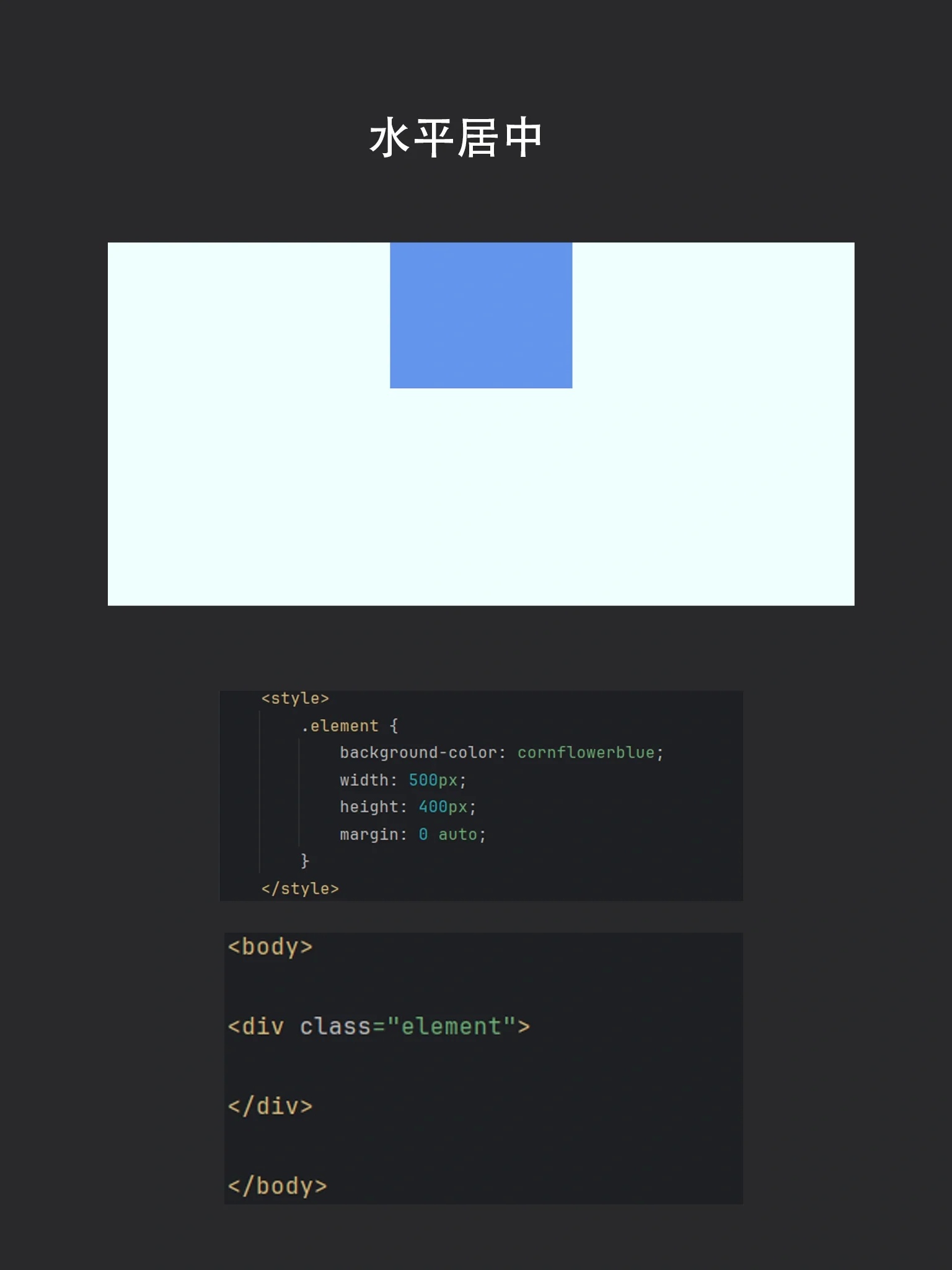
水平居中
行内元素(如 <span>、<a>)
.container {
  text-align: center; /* 父级容器添加该属性 */
}
原理:通过父容器的 text-align: center 控制内部行内内容居中。
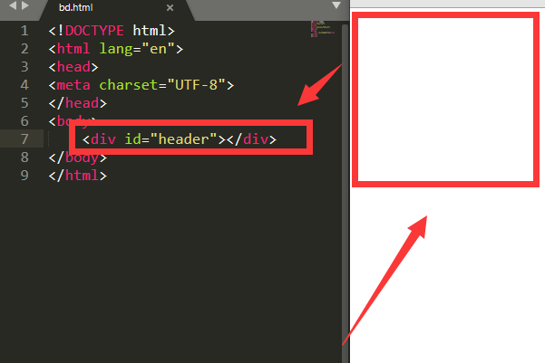
块级元素(如 <div>、<p>)
.block-element {
  width: 80%; /* 必须设置宽度 */
  margin: 0 auto; /* 左右外边距自适应 */
}
注意:块级元素需明确宽度(非100%),否则无法生效。

垂直居中
单行文本
.container {
  height: 100px; /* 容器需有固定高度 */
  line-height: 100px; /* 行高等于容器高度 */
}
多行文本
Flexbox布局(推荐)
.container {
  display: flex;
  align-items: center; /* 垂直居中 */
  justify-content: center; /* 水平居中 */
  height: 200px; /* 需设置高度 */
}
Grid布局
.container {
  display: grid;
  place-items: center; /* 水平+垂直居中 */
  height: 200px;
}
绝对定位(兼容旧浏览器)
.container {
  position: relative;
  height: 200px;
}
.text {
  position: absolute;
  top: 50%;
  left: 50%;
  transform: translate(-50%, -50%); /* 偏移自身宽高的50% */
}
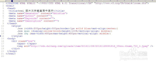
水平+垂直居中
最佳实践:Flexbox
<div class="container">
  <p>任意内容居中</p>
</div>
<style>
.container {
  display: flex;
  align-items: center; /* 垂直居中 */
  justify-content: center; /* 水平居中 */
  min-height: 300px; /* 最小高度保证容器可见 */
}
</style>
替代方案:Grid
.container {
  display: grid;
  place-items: center; /* 一行代码实现双向居中 */
}
特殊场景方案
表格单元格居中
td, th {
  text-align: center; /* 水平 */
  vertical-align: middle; /* 垂直 */
}
浮动元素居中
.float-element {
  float: left;
  position: relative;
  left: 50%;
  transform: translateX(-50%); /* 反向偏移 */
}
响应式注意事项
- 使用相对单位(如 、
rem)替代固定像素值。 - 结合媒体查询调整居中样式:
@media (max-width: 768px) {
  .container {
    text-align: left; /* 小屏幕左对齐 */
  }
}
总结建议
- 现代方案:优先使用 Flexbox 或 Grid(兼容主流浏览器)。
- 传统方案:
text-align+line-height适合简单文本。 - :绝对定位 +
transform适应未知宽高元素。 - 语义化:始终用HTML描述内容结构,CSS控制样式。
权威参考:
- MDN Web Docs:Flexbox布局
- W3C CSS规范:文本居中
- CSS Tricks:居中完全指南