上一篇
html文字绝对居中
要实现HTML文字绝对居中,可使用
display: flex配合 margin: auto,并添加 text-align: center确保多行文本居中,兼容主流浏览器
Flexbox 实现绝对居中
原理:通过 display: flex 将父元素设为弹性盒模型,配合 align-items 和 justify-content 实现水平和垂直居中。
适用场景:现代浏览器,需兼容 IE10+。
| 属性 | 值 | 作用 |
|---|---|---|
display | flex | 启用弹性布局 |
align-items | center | 垂直方向居中 |
justify-content | center | 水平方向居中 |
示例代码:
<div class="container">
  <div class="center-text">文字内容</div>
</div>
.container {
  display: flex;
  align-items: center; / 垂直居中 /
  justify-content: center; / 水平居中 /
  height: 300px; / 父元素需明确高度 /
}
.center-text {
  text-align: center; / 可选:确保多行文本居中对齐 /
}
Grid 布局实现绝对居中
原理:通过 display: grid 将父元素设为网格容器,配合 place-items 快速居中。
适用场景:现代浏览器,需兼容 IE11+。

| 属性 | 值 | 作用 |
|---|---|---|
display | grid | 启用网格布局 |
place-items | center | 同时实现水平和垂直居中 |
示例代码:
<div class="grid-container">
  <div class="center-text">文字内容</div>
</div>
.grid-container {
  display: grid;
  place-items: center; / 等效于 align-content + justify-content /
  height: 300px; / 父元素需明确高度 /
}
绝对定位 + 负边距(传统方案)
原理:通过 position: absolute 将元素定位到父容器中心,再用 transform 偏移。
适用场景:需兼容老旧浏览器(如 IE6+)。
| 属性 | 值 | 作用 |
|---|---|---|
position | absolute | 绝对定位 |
top/left/right/bottom | 0 | 占满父容器 |
transform | translate(-50%, -50%) | 偏移自身宽高的一半 |
示例代码:
<div class="relative-container">
  <div class="absolute-center">文字内容</div>
</div>
.relative-container {
  position: relative;
  height: 300px; / 父元素需明确高度 /
}
.absolute-center {
  position: absolute;
  top: 50%;
  left: 50%;
  transform: translate(-50%, -50%); / 关键偏移 /
  text-align: center; / 确保多行文本居中 /
}
方法对比与选择建议
| 方法 | 兼容性 | 代码简洁度 | 是否需要父元素高度 | 适用场景 |
|---|---|---|---|---|
| Flexbox | IE10+ | 是 | 现代主流项目 | |
| Grid | IE11+ | 是 | 现代项目(更简洁) | |
| 绝对定位 | IE6+ | 是 | 老旧浏览器兼容 | |
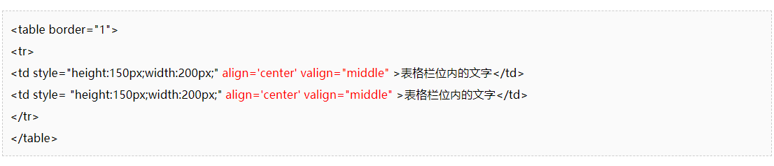
| Table-Cell | IE8+ | 是 | 特殊布局需求(不推荐) |
相关问题与解答
问题1:为什么直接用 text-align: center 无法实现垂直居中?
解答:text-align: center 仅对行内内容(如文字、图片)进行水平居中,无法控制垂直方向的对齐,需结合其他方法(如 Flexbox/Grid)实现垂直居中。
问题2:如果父元素高度未知,如何实现绝对居中?
解答:若父元素高度由内容撑开(无固定高度),可搭配以下方案:
- Flexbox:父元素设
height: 100vh(视口高度)或height: fit-content。 - Grid:同上,或使用
min-height: 100vh。 - 绝对定位:父元素需为相对
相关文章
html文字绝对居中

在html中如何让图片居中 html如何把图片居中,图片居中怎么设置html
关于AngularJS中的ngbindhtml指令,一个原创的疑问句标题可以是,,如何在AngularJS中使用ngbindhtml指令安全地绑定并显示HTML内容?,清晰地表达了想要了解如何在AngularJS中利用ngbindhtml指令来绑定并显示HTML内容,同时强调了安全地这一关键点,表明提问者对于数据绑定的安全性有所关注。
html文字左居中
html文字居中
html文字放大居中
div如何垂直居中显示,cssdiv垂直居中「div内div垂直居中」

html水平居中和垂直居中怎么设置