上一篇
htmljs背景特效
HTML构建页面结构,JS实现动态交互,CSS定义视觉效果,三者协同打造炫酷背景特效
HTML+JS背景特效实现指南
基础背景设置
| 属性名 | 说明 | 示例效果 |
|---|---|---|
background-color | 纯色背景 | 红色背景:background-color: #FF0000; |
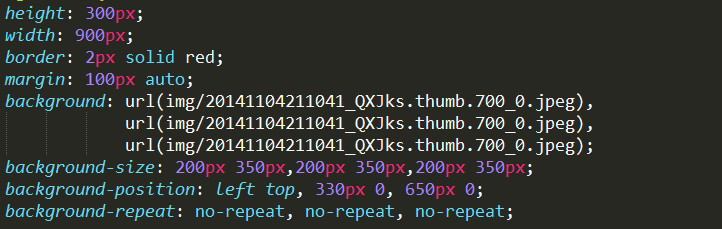
background-image | 图片背景 | background-image: url('bg.jpg'); |
background-size | 背景尺寸 | cover:等比缩放铺满容器contain:保持比例缩放 |
background-repeat | 平铺方式 | no-repeat:不平铺repeat:沿X/Y轴平铺 |
background-position | 定位位置 | center:居中left top:左上对齐 |
<div id="basic-bg" style="width:300px;height:200px;background:url('bg.jpg') no-repeat center/cover;"></div>渐变背景实现
| 类型 | CSS语法 | 效果特点 |
|---|---|---|
| 线性渐变 | linear-gradient(方向,色1,色2) | 颜色按直线过渡 |
| 径向渐变 | radial-gradient(形状 尺寸,色1,色2) | 中心向外扩散过渡 |
| 多色渐变 | 多个颜色节点 | 创建复杂过渡效果 |
/ 从左到右的蓝紫渐变 /
#linear-bg {
  background: linear-gradient(to right, #1e3f8b, #e94560);
}
/ 圆形彩虹渐变 /
#radial-bg {
  background: radial-gradient(circle at center, #ff6f61, #7c3aed);
}
动态背景特效
呼吸光效(CSS动画)
@keyframes breath {
  0% { background-color: #1e3f8b; }
  50% { background-color: #e94560; }
  100% { background-color: #1e3f8b; }
}
#breath-bg {
  animation: breath 3s infinite;
}
粒子流动效果(Canvas实现)
// HTML结构
<canvas id="particle-canvas" style="position:fixed;top:0;left:0;z-index:-1"></canvas>
// JavaScript代码
const canvas = document.getElementById('particle-canvas');
const ctx = canvas.getContext('2d');
canvas.width = window.innerWidth;
canvas.height = window.innerHeight;
const particles = [];
for(let i=0; i<100; i++){
  particles.push({
    x: Math.random()canvas.width,
    y: Math.random()canvas.height,
    r: Math.random()3+1,
    vx: Math.random()2-1,
    vy: Math.random()2-1,
    color: `hsla(${Math.random()360},80%,50%,0.8)`
  });
}
function animate(){
  ctx.clearRect(0,0,canvas.width,canvas.height);
  particles.forEach(p=>{
    ctx.fillStyle = p.color;
    ctx.beginPath();
    ctx.arc(p.x,p.y,p.r,0,Math.PI2);
    ctx.fill();
    p.x += p.vx;
    p.y += p.vy;
    if(p.x<0 || p.x>canvas.width) p.vx = -1;
    if(p.y<0 || p.y>canvas.height) p.vy = -1;
  });
  requestAnimationFrame(animate);
}
animate();
响应式背景适配
| 场景 | 解决方案 | 代码示例 |
|---|---|---|
| 移动端适配 | 使用媒体查询调整背景尺寸 | css<br>@media (max-width:768px){<br> body{background-size:auto 100%;}<br>} |
| 视口滚动 | 固定背景定位 | background-attachment: fixed; |
| 多设备兼容 | 使用百分比单位 | background-size:100% auto; |
性能优化技巧
- 图片优化:使用WebP格式,启用懒加载
html<br>`<img src="bg.webp" loading="lazy" /> - 动画优化:
- 使用
transform代替top/left - 开启GPU加速:
will-change: transform; - 限制动画层数(建议不超过3层)
- 使用
- 预加载资源:
javascript<br>const bg = new Image();<br>bg.src = 'parallax-bg.jpg';<br>document.body.style.backgroundImage = `url(${bg.src})`;
常见问题与解答
Q1:如何让背景图在不同屏幕比例下保持最佳显示?
A:使用background-size: cover;配合媒体查询,当需要等比缩放时,可设置background-size: contain;,并通过background-position: center;保持居中,对于响应式布局,建议结合vw/vh单位或calc()函数动态计算尺寸。

Q2:Canvas粒子背景导致移动端卡顿怎么办?
A:1. 降低粒子数量(建议移动端不超过50个)
2. 简化绘制逻辑,合并绘图操作
3. 使用requestAnimationFrame替代setInterval
4. 检测设备性能:
“`javascript
if(/Mobi|Android/.test(navigator.userAgent)){
// 启用简化版
相关文章

关于AngularJS中的ngbindhtml指令,一个原创的疑问句标题可以是,,如何在AngularJS中使用ngbindhtml指令安全地绑定并显示HTML内容?,清晰地表达了想要了解如何在AngularJS中利用ngbindhtml指令来绑定并显示HTML内容,同时强调了安全地这一关键点,表明提问者对于数据绑定的安全性有所关注。
cdn mlj36 似乎是一个不完整的短语或代码,没有足够的信息来生成一个有意义的疑问句标题。如果这是关于内容分发网络(CDN)和机器学习(ML)的某种特定技术或模型的引用,请提供更多上下文以便能够创建一个相关的疑问句标题。例如,,什么是cdn mlj36,它是如何结合CDN和机器学习技术的?,但请注意,由于缺乏具体信息,上述标题仅基于假设。如果您能提供更详细的背景或文章内容,我可以帮助您创建一个更加准确和原创的疑问句标题。

CDN背景特效,如何实现和优化?
如何利用CDN背景特效提升网站性能与用户体验?
如何通过CSS背景读取数据库中的数据?

如何实现CSS背景渐变效果?

WPS背景揭秘,你真的了解它的来龙去脉吗?
如何有效地使用CSS背景图片来增强网页设计?
htmljs语言