上一篇
CSS怎样实现hr左对齐?
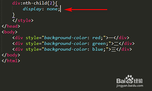
要使HTML中的`
元素向左对齐,可设置其宽度(如width: 50%
)并添加margin-left: 0
样式,或通过父容器的text-align: left`控制对齐方向。
如何在HTML中实现hr元素向左对齐
理解hr元素及其默认行为
<hr>元素(水平线)在HTML中默认是块级元素并占据整个可用宽度,这意味着它会自动拉伸到其容器的100%宽度,在大多数浏览器中,默认表现为居中显示。
<!-- 默认hr元素 -->
<hr>
实现hr左对齐的5种方法
方法1:使用CSS margin属性
最简洁的方法是通过调整外边距实现左对齐:
<style>
  .hr-left {
    margin-left: 0;
    margin-right: auto;
  }
</style>
<hr class="hr-left">
方法2:设置固定宽度+左浮动
结合宽度设置和浮动属性:

<style>
  .hr-float-left {
    width: 50%; /* 可调整宽度 */
    float: left;
    clear: both; /* 清除浮动影响 */
  }
</style>
<hr class="hr-float-left">
方法3:使用Flexbox布局
在现代布局中使用Flex容器:
<div style="display: flex;">
  <hr style="width: 70%;"> <!-- 可调整宽度 -->
</div>
方法4:绝对定位法
精确定位到左侧位置:
<div style="position: relative; height: 20px;">
  <hr style="position: absolute; left: 0; width: 40%;">
</div>
方法5:使用text-align属性
利用容器文本对齐属性:
<div style="text-align: left;">
  <hr style="display: inline-block; width: 60%;">
</div>
效果对比展示
<div class="comparison">
  <div>
    <h3>默认居中效果</h3>
    <hr class="default-hr">
  </div>
  <div>
    <h3>左对齐效果</h3>
    <hr class="left-aligned-hr">
  </div>
</div>
实际应用场景
- 不对称布局设计:在创意布局中制造视觉不平衡分隔**:作为段落或章节的左侧分隔线
- 时间线设计:左侧对齐作为时间轴元素
- 侧边栏装饰:在边栏中使用短分隔线
- 响应式设计:在小屏幕上保留左侧空间
浏览器兼容性和注意事项
- 所有现代浏览器都支持这些技术
- 在IE中可能需要额外的前缀或替代方案
- 始终考虑响应式设计:在小屏幕上可能需要全宽
- 结合CSS变量实现动态控制:
<style>
  :root {
    --hr-width: 80%;
  }
  .hr-variable {
    width: var(--hr-width);
    margin-left: 0;
  }
</style>
创意设计示例
<div class="creative-hr">
  <hr class="gradient-hr">
  <hr class="dashed-hr">
  <hr class="dotted-hr">
</div>
<style>
  .gradient-hr {
    height: 4px;
    background: linear-gradient(to right, #ff7e5f, #feb47b);
    border: none;
    margin-left: 0;
    width: 60%;
  }
  .dashed-hr {
    border: 1px dashed #4CAF50;
    margin-left: 0;
    width: 45%;
  }
  .dotted-hr {
    border: 2px dotted #2196F3;
    margin-left: 0;
    width: 30%;
  }
</style>
响应式设计技巧
<style>
  .responsive-hr {
    margin-left: 0;
    width: 80%;
  }
  @media (max-width: 768px) {
    .responsive-hr {
      width: 100%; /* 小屏幕全宽 */
    }
  }
</style>
通过以上方法,您可以轻松实现hr元素的左对齐效果,增强网页设计的灵活性和视觉吸引力,掌握这些CSS技术能让您更好地控制页面布局,创造独特的视觉效果。
参考:MDN Web文档 – CSS布局模块、W3C CSS规范、现代Web开发最佳实践
<!DOCTYPE html>
<html lang="zh-CN">
<head>
<meta charset="UTF-8">
<meta name="viewport" content="width=device-width, initial-scale=1.0">如何在HTML中实现hr元素向左对齐</title>
<link rel="stylesheet" href="https://cdnjs.cloudflare.com/ajax/libs/font-awesome/6.4.0/css/all.min.css">
<style>
* {
box-sizing: border-box;
margin: 0;
padding: 0;
}
body {
font-family: 'Segoe UI', Tahoma, Geneva, Verdana, sans-serif;
line-height: 1.6;
color: #333;
background: linear-gradient(135deg, #f5f7fa 0%, #e4edf5 100%);
padding: 20px;
max-width: 1200px;
margin: 0 auto;
}
header {
text-align: center;
padding: 40px 20px;
background: linear-gradient(120deg, #1a2980, #26d0ce);
color: white;
border-radius: 15px;
margin-bottom: 40px;
box-shadow: 0 10px 30px rgba(0,0,0,0.15);
position: relative;
overflow: hidden;
}
header h1 {
font-size: 2.8rem;
margin-bottom: 15px;
text-shadow: 2px 2px 4px rgba(0,0,0,0.3);
}
header p {
font-size: 1.2rem;
max-width: 800px;
margin: 0 auto;
opacity: 0.9;
}
.container {
display: grid;
grid-template-columns: 1fr;
gap: 30px;
margin-bottom: 50px;
}
.card {
background: white;
border-radius: 12px;
padding: 30px;
box-shadow: 0 5px 15px rgba(0,0,0,0.08);
transition: transform 0.3s ease, box-shadow 0.3s ease;
}
.card:hover {
transform: translateY(-5px);
box-shadow: 0 8px 25px rgba(0,0,0,0.12);
}
.card h2 {
color: #1a2980;
margin-bottom: 20px;
padding-bottom: 15px;
border-bottom: 2px solid #26d0ce;
display: flex;
align-items: center;
}
.card h2 i {
margin-right: 10px;
color: #26d0ce;
}
.method-section {
margin-bottom: 30px;
}
.method-section h3 {
color: #2c3e50;
margin-bottom: 15px;
display: flex;
align-items: center;
}
.method-section h3 i {
color: #26d0ce;
margin-right: 10px;
}
.code-block {
background: #1e1e1e;
color: #dcdcdc;
padding: 20px;
border-radius: 8px;
font-family: 'Courier New', monospace;
margin: 15px 0;
overflow-x: auto;
position: relative;
}
.code-block::before {
content: '代码示例';
position: absolute;
top: 0;
left: 0;
background: #26d0ce;
color: white;
padding: 5px 10px;
border-radius: 0 0 8px 0;
font-size: 0.9rem;
}
.hr-preview {
background: #f8f9fa;
padding: 20px;
border-radius: 8px;
margin: 20px 0;
border-left: 4px solid #26d0ce;
}
.hr-display {
margin: 15px 0;
}
.comparison-container {
display: flex;
flex-wrap: wrap;
gap: 30px;
margin: 30px 0;
}
.compare-box {
flex: 1;
min-width: 300px;
background: #f8f9fa;
padding: 25px;
border-radius: 10px;
border-top: 4px solid #26d0ce;
text-align: center;
}
.creative-hrs {
display: flex;
flex-direction: column;
gap: 25px;
margin: 20px 0;
}
.creative-hr {
height: 4px;
border: none;
margin-left: 0;
}
.hr-1 {
width: 80%;
background: linear-gradient(to right, #ff7e5f, #feb47b);
}
.hr-2 {
width: 60%;
border-top: 2px dashed #4CAF50;
}
.hr-3 {
width: 40%;
border-top: 3px dotted #2196F3;
}
.tip-box {
background: #e3f2fd;
border-left: 4px solid #2196F3;
padding: 15px;
margin: 20px 0;
border-radius: 0 8px 8px 0;
}
.tip-box h4 {
color: #0d47a1;
margin-bottom: 10px;
}
.responsive-demo {
padding: 20px;
background: #f1f8e9;
border-radius: 8px;
margin: 20px 0;
border-left: 4px solid #7cb342;
}
.responsive-hr {
margin-left: 0;
width: 80%;
height: 3px;
background: linear-gradient(to right, #7b4397, #dc2430);
border: none;
}
footer {
text-align: center;
padding: 30px;
margin-top: 40px;
background: #2c3e50;
color: #ecf0f1;
border-radius: 15px;
font-size: 0.95rem;
}
.ref-box {
background: rgba(255, 255, 255, 0.1);
display: inline-block;
padding: 10px 20px;
border-radius: 30px;
margin-top: 15px;
}
@media (max-width: 768px) {
.comparison-container {
flex-direction: column;
}
header h1 {
font-size: 2.2rem;
}
.responsive-hr {
width: 100%;
}
}
</style>
</head>
<body>
<header>
<h1><i class="fas fa-align-left"></i> 实现HTML水平线左对齐</h1>
<p>多种CSS方法实现hr元素向左对齐的完整指南</p>
</header>
<div class="container">
<div class="card">
<h2><i class="fas fa-lightbulb"></i> 理解hr元素</h2>
<p>HTML中的<code><hr></code>元素(水平线)默认是居中显示的块级元素,占据全部可用宽度,本指南将展示如何通过CSS使其向左对齐。</p>
<div class="code-block">
<!-- 默认居中的hr元素 -->
<hr>
</div>
<div class="hr-preview">
<h3>默认居中效果:</h3>
<hr class="default-hr">
</div>
</div>
<div class="card">
<h2><i class="fas fa-code"></i> 实现左对齐的5种方法</h2>
<div class="method-section">
<h3><i class="fas fa-arrow-right"></i> 方法1:使用margin属性</h3>
<p>通过设置margin-left为0和margin-right为auto实现左对齐:</p>
<div class="code-block">
<style>
.hr-left {
margin-left: 0;
margin-right: auto;
}
</style>
<hr class="hr-left">
</div>
<div class="hr-preview">
<h4>实现效果:</h4>
<hr style="margin-left: 0; margin-right: auto;">
</div>
</div>
<div class="method-section">
<h3><i class="fas fa-arrow-right"></i> 方法2:设置固定宽度+左浮动</h3>
<p>结合宽度设置和浮动属性实现左对齐:</p>
<div class="code-block">
<style>
.hr-float-left {
width: 50%;
float: left;
clear: both;
}
</style>
<hr class="hr-float-left">
</div>
<div class="hr-preview">
<h4>实现效果:</h4>
<hr style="width: 50%; float: left; clear: both;">
</div>
</div>
<div class="method-section">
<h3><i class="fas fa-arrow-right"></i> 方法3:使用Flexbox布局</h3>
<p>在现代布局中使用Flex容器:</p>
<div class="code-block">
<div style="display: flex;">
<hr style="width: 70%;">
</div>
</div>
<div class="hr-preview">
<h4>实现效果:</h4>
<div style="display: flex;">
<hr style="width: 70%;">
</div>
</div>
</div>
</div>
<div class="card">
<h2><i class="fas fa-laptop"></i> 效果对比</h2>
<div class="comparison-container">
<div class="compare-box">
<h3>默认居中效果</h3>
<div class="hr-display">
<hr>
</div>
<p>默认情况下,水平线居中显示并占据整个容器宽度。</p>
</div>
<div class="compare-box">
<h3>左对齐效果</h3>
<div class="hr-display">
<hr style="margin-left: 0; margin-right: auto; width: 80%;">
</div>
<p>左对齐的水平线为设计提供了更多灵活性,特别适合现代网页布局。</p>
</div>
</div>
</div>
<div class="card">
<h2><i class="fas fa-paint-brush"></i> 创意设计示例</h2>
<p>左对齐水平线可以创造性地增强视觉设计:</p>
<div class="creative-hrs">
<hr class="creative-hr hr-1">
<hr class="creative-hr hr-2">
<hr class="creative-hr hr-3">
</div>
<div class="code-block">
<style>
.gradient-hr {
width: 80%;
height: 4px;
background: linear-gradient(to right, #ff7e5f, #feb47b);
margin-left: 0;
}
.dashed-hr {
width: 60%;
border: none;
border-top: 2px dashed #4CAF50;
margin-left: 0;
}
.dotted-hr {
width: 40%;
border: none;
border-top: 3px dotted #2196F3;
margin-left: 0;
}
</style>
<hr class="gradient-hr">
<hr class="dashed-hr">
<hr class="dotted-hr">
</div>
</div>
<div class="card">
<h2><i class="fas fa-mobile-alt"></i> 响应式设计技巧</h2>
<div class="responsive-demo">
<h3>响应式水平线示例</h3>
<p>调整浏览器窗口大小查看效果:</p>
<hr class="responsive-hr">
</div>
<div class="code-block">
<style>
.responsive-hr {
margin-left: 0;
width: 80%;
height: 3px;
background: linear-gradient(to right, #7b4397, #dc2430);
}
@media (max-width: 768px) {
.responsive-hr {
width: 100%;
}
}
</style>
<hr class="responsive-hr">
</div>
<div class="tip-box">
<h4><i class="fas fa-info-circle"></i> 专业提示:</h4>
<p>使用CSS变量可以使水平线宽度更易于管理:</p>
<div class="code-block">
<style>
:root {
--hr-width: 80%;
}
.hr-variable {
width: var(--hr-width);
margin-left: 0;
}
@media (max-width: 768px) {
:root {
--hr