上一篇
如何用HTML轻松制作圣诞树

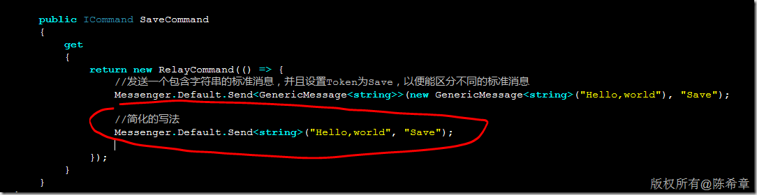
使用HTML构建圣诞树主要依靠`
标签或嵌套`形成树形结构,通过CSS添加绿色背景、装饰色块和阴影效果,最后用JavaScript实现灯光闪烁等动态交互,可在网页直接渲染节日效果。
HTML圣诞树制作指南:打造节日氛围的代码艺术
以下是如何使用HTML和CSS创建一个精美圣诞树的详细指南:
<!DOCTYPE html>
<html lang="zh-CN">
<head>
<meta charset="UTF-8">
<meta name="viewport" content="width=device-width, initial-scale=1.0">HTML圣诞树制作指南</title>
<style>
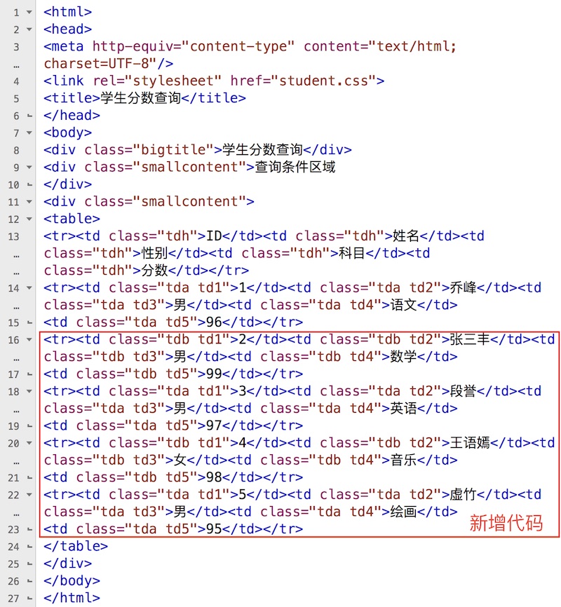
* {
margin: 0;
padding: 0;
box-sizing: border-box;
}
body {
font-family: 'Segoe UI', Tahoma, Geneva, Verdana, sans-serif;
background: linear-gradient(135deg, #0f2027, #203a43, #2c5364);
color: #fff;
min-height: 100vh;
padding: 40px 20px 80px;
display: flex;
flex-direction: column;
align-items: center;
position: relative;
overflow-x: hidden;
}
.snowflakes {
position: absolute;
top: 0;
left: 0;
width: 100%;
height: 100%;
pointer-events: none;
z-index: 1;
}
.snowflake {
position: absolute;
top: -20px;
color: #ffffff;
opacity: 0.8;
animation: snowfall linear forwards;
user-select: none;
}
@keyframes snowfall {
to {
transform: translateY(105vh) rotate(360deg);
opacity: 0.3;
}
}
.container {
max-width: 1000px;
width: 100%;
margin: 0 auto;
position: relative;
z-index: 2;
}
header {
text-align: center;
padding: 40px 20px;
margin-bottom: 40px;
position: relative;
}
h1 {
font-size: 3.5rem;
margin-bottom: 20px;
background: linear-gradient(to right, #f8d210, #ffa000, #ff6600);
-webkit-background-clip: text;
background-clip: text;
color: transparent;
text-shadow: 0 0 20px rgba(255, 166, 0, 0.3);
letter-spacing: 2px;
}
.subtitle {
font-size: 1.4rem;
color: #d1e7ff;
max-width: 700px;
margin: 0 auto 30px;
line-height: 1.6;
}
.main-content {
display: grid;
grid-template-columns: 1fr 1fr;
gap: 40px;
margin-bottom: 60px;
}
@media (max-width: 768px) {
.main-content {
grid-template-columns: 1fr;
}
}
.demo-container {
background: rgba(0, 20, 40, 0.7);
border-radius: 15px;
padding: 30px;
box-shadow: 0 10px 30px rgba(0, 0, 0, 0.4);
display: flex;
flex-direction: column;
align-items: center;
justify-content: center;
min-height: 500px;
border: 1px solid rgba(0, 150, 255, 0.2);
}
.tree-container {
position: relative;
perspective: 1000px;
margin-top: 20px;
width: 300px;
height: 400px;
display: flex;
justify-content: center;
align-items: flex-end;
}
.tree {
position: relative;
width: 200px;
height: 320px;
transform-style: preserve-3d;
animation: rotateTree 20s infinite linear;
}
.tree-layer {
position: absolute;
border-left: 75px solid transparent;
border-right: 75px solid transparent;
border-bottom: 50px solid #0a5f20;
bottom: 0;
left: 0;
transform-origin: center bottom;
}
.tree-layer:nth-child(1) {
width: 180px;
height: 70px;
border-bottom-color: #0d7d2b;
transform: translateY(-10px) scale(0.9);
}
.tree-layer:nth-child(2) {
width: 150px;
height: 70px;
border-bottom-color: #0a5f20;
transform: translateY(50px) scale(0.8);
}
.tree-layer:nth-child(3) {
width: 120px;
height: 70px;
border-bottom-color: #0d7d2b;
transform: translateY(110px) scale(0.7);
}
.tree-layer:nth-child(4) {
width: 90px;
height: 70px;
border-bottom-color: #0a5f20;
transform: translateY(170px) scale(0.6);
}
.tree-layer:nth-child(5) {
width: 60px;
height: 70px;
border-bottom-color: #0d7d2b;
transform: translateY(230px) scale(0.5);
}
.trunk {
position: absolute;
width: 20px;
height: 50px;
background: #8B4513;
bottom: 0;
left: 90px;
border-radius: 5px;
transform: translateZ(10px);
}
.star {
position: absolute;
top: -30px;
left: 85px;
width: 30px;
height: 30px;
background: gold;
clip-path: polygon(50% 0%, 61% 35%, 98% 35%, 68% 57%, 79% 91%, 50% 70%, 21% 91%, 32% 57%, 2% 35%, 39% 35%);
transform: translateZ(30px);
animation: shining 2s infinite alternate;
box-shadow: 0 0 20px gold;
}
.ornament {
position: absolute;
width: 12px;
height: 12px;
border-radius: 50%;
z-index: 10;
animation: bounce 4s infinite ease-in-out;
}
.ornament:nth-child(1) { top: 30px; left: 60px; background: #FF4136; animation-delay: 0s; }
.ornament:nth-child(2) { top: 60px; left: 120px; background: #0074D9; animation-delay: 0.8s; }
.ornament:nth-child(3) { top: 100px; left: 45px; background: #FF851B; animation-delay: 1.6s; }
.ornament:nth-child(4) { top: 140px; left: 130px; background: #B10DC9; animation-delay: 2.4s; }
.ornament:nth-child(5) { top: 170px; left: 70px; background: #2ECC40; animation-delay: 3.2s; }
.ornament:nth-child(6) { top: 220px; left: 115px; background: #FFDC00; animation-delay: 4s; }
@keyframes rotateTree {
0% { transform: rotateY(0); }
100% { transform: rotateY(360deg); }
}
@keyframes shining {
0% { transform: scale(1) translateZ(30px); }
100% { transform: scale(1.2) translateZ(30px); box-shadow: 0 0 30px gold, 0 0 50px rgba(255, 215, 0, 0.7); }
}
@keyframes bounce {
0%, 100% { transform: translateY(0); }
50% { transform: translateY(-20px); }
}
.lights {
position: absolute;
width: 100%;
height: 100%;
pointer-events: none;
}
.light {
position: absolute;
width: 8px;
height: 8px;
border-radius: 50%;
background: #FF0000;
box-shadow: 0 0 8px #FF0000;
animation: blink 1s infinite alternate;
}
.light:nth-child(1) { top: 45px; left: 85px; animation-delay: 0.2s; }
.light:nth-child(2) { top: 95px; left: 125px; animation-delay: 0.8s; }
.light:nth-child(3) { top: 135px; left: 70px; animation-delay: 1.4s; }
.light:nth-child(4) { top: 185px; left: 110px; animation-delay: 2s; }
.light:nth-child(5) { top: 225px; left: 50px; animation-delay: 0.6s; }
@keyframes blink {
0% { opacity: 0.3; }
100% { opacity: 1; }
}
.instructions {
background: rgba(0, 20, 40, 0.7);
border-radius: 15px;
padding: 30px;
box-shadow: 0 10px 30px rgba(0, 0, 0, 0.4);
border: 1px solid rgba(0, 150, 255, 0.2);
}
h2 {
font-size: 2.2rem;
margin-bottom: 25px;
color: #4dabf7;
position: relative;
padding-bottom: 10px;
border-bottom: 2px solid rgba(77, 171, 247, 0.3);
}
h3 {
font-size: 1.5rem;
margin: 25px 0 15px;
color: #ffd43b;
}
.step {
margin-bottom: 20px;
background: rgba(30, 60, 90, 0.4);
padding: 20px;
border-radius: 10px;
transition: transform 0.3s ease;
}
.step:hover {
transform: translateY(-5px);
background: rgba(40, 70, 100, 0.5);
}
.step p {
margin-bottom: 15px;
line-height: 1.7;
color: #c5e4ff;
}
.code-block {
background: #1e2b3a;
padding: 16px;
border-radius: 8px;
font-family: 'Courier New', monospace;
font-size: 1rem;
margin: 15px 0;
overflow-x: auto;
border-left: 4px solid #4dabf7;
}
.code-block code {
color: #f1fa8c;
display: block;
white-space: pre;
}
.tip {
background: rgba(255, 215, 0, 0.1);
border-left: 4px solid #ffd700;
padding: 12px 20px;
margin: 20px 0;
border-radius: 0 8px 8px 0;
}
.conclusion {
background: rgba(255, 255, 255, 0.1);
padding: 30px;
border-radius: 15px;
margin-top: 40px;
text-align: center;
box-shadow: 0 5px 20px rgba(0, 0, 0, 0.3);
}
.conclusion p {
font-size: 1.2rem;
line-height: 1.8;
margin-bottom: 20px;
max-width: 800px;
margin-left: auto;
margin-right: auto;
}
.btn {
display: inline-block;
background: linear-gradient(to right, #ff9800, #ff5722);
color: white;
padding: 14px 28px;
border-radius: 50px;
text-decoration: none;
font-weight: bold;
font-size: 1.1rem;
transition: all 0.3s ease;
box-shadow: 0 5px 15px rgba(255, 87, 34, 0.4);
margin-top: 10px;
border: none;
cursor: pointer;
}
.btn:hover {
transform: translateY(-3px);
box-shadow: 0 8px 20px rgba(255, 87, 34, 0.6);
}
footer {
text-align: center;
margin-top: 60px;
padding: 30px;
color: #a3d0ff;
font-size: 0.95rem;
border-top: 1px solid rgba(100, 150, 200, 0.2);
width: 100%;
}
.features {
display: grid;
grid-template-columns: repeat(auto-fit, minmax(300px, 1fr));
gap: 25px;
margin: 40px 0;
}
.feature-card {
background: rgba(40, 70, 100, 0.4);
padding: 25px;
border-radius: 10px;
text-align: center;
transition: all 0.3s ease;
border: 1px solid rgba(0, 150, 255, 0.2);
}
.feature-card:hover {
transform: translateY(-10px);
box-shadow: 0 15px 30px rgba(0, 0, 0, 0.2);
border-color: rgba(0, 200, 255, 0.4);
}
.feature-card h4 {
font-size: 1.4rem;
margin-bottom: 15px;
color: #ffd43b;
}
.feature-card p {
color: #c5e4ff;
line-height: 1.7;
}
</style>
</head>
<body>
<div class="snowflakes" id="snowflakes"></div>
<div class="container">
<header>
<h1>HTML & CSS 圣诞树制作指南</h1>
<p class="subtitle">探索如何使用纯前端技术创建精美的3D圣诞树,为您的网站增添节日氛围</p>
</header>
<div class="main-content">
<div class="demo-container">
<h2>3D旋转圣诞树实例</h2>
<div class="tree-container">
<div class="tree">
<div class="tree-layer"></div>
<div class="tree-layer"></div>
<div class="tree-layer"></div>
<div class="tree-layer"></div>
<div class="tree-layer"></div>
<div class="trunk"></div>
<div class="star"></div>
<div class="ornament"></div>
<div class="ornament"></div>
<div class="ornament"></div>
<div class="ornament"></div>
<div class="ornament"></div>
<div class="ornament"></div>
<div class="lights">
<div class="light"></div>
<div class="light"></div>
<div class="light"></div>
<div class="light"></div>
<div class="light"></div>
</div>
</div>
</div>
<p class="tip">提示:将鼠标悬停在下方步骤上可查看动画效果</p>
</div>
<div class="instructions">
<h2>制作步骤详解</h2>
<div class="step">
<h3>1. 创建基本HTML结构</h3>
<p>首先设置容器和多个div元素来构建圣诞树的层次结构:</p>
<div class="code-block">
<code><div class="tree-container">
<div class="tree">
<div class="tree-layer"></div>
<div class="tree-layer"></div>
<div class="tree-layer"></div>
<div class="tree-layer"></div>
<div class="tree-layer"></div>
<div class="trunk"></div>
</div>
</div></code>
</div>
</div>
<div class="step">
<h3>2. 使用CSS创建树层</h3>
<p>利用CSS border属性创建三角形树层:</p>
<div class="code-block">
<code>.tree-layer {
position: absolute;
border-left: 75px solid transparent;
border-right: 75px solid transparent;
border-bottom: 50px solid #0a5f20;
bottom: 0;
left: 0;
}</code>
</div>
<p class="tip">通过调整border尺寸和颜色创建不同大小的树层</p>
</div>
<div class="step">
<h3>3. 添加