上一篇
如何在html 中插入表格
在 HTML 中插入表格需使用 `
标签定义表格,内部用
定义行,
(普通单元格)或
(表头单元格)定义列,可搭配 border` 等属性设置
基础表格结构
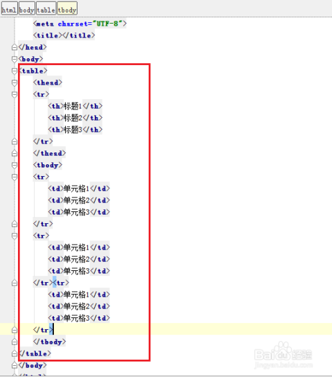
HTML表格由三大核心元素构成:<table>定义表格容器,<tr>表示行(Table Row),<td>代表普通单元格(Table Data),若需表头单元格,可使用<th>(Table Header),典型结构如下:
<table>
  <tr>
    <th>姓名</th>
    <th>年龄</th>
    <th>职业</th>
  </tr>
  <tr>
    <td>张三</td>
    <td>28</td>
    <td>工程师</td>
  </tr>
  <tr>
    <td>李四</td>
    <td>32</td>
    <td>设计师</td>
  </tr>
</table>
此代码生成一个包含两行数据的三列表格,第一行为表头(默认加粗居中),后续为数据行,浏览器会自动为表格添加基础样式,但实际效果取决于浏览器默认设置。
关键细节说明
<caption>:为表格添加标题,位于<table>内部首位,通常显示在表格顶部中央。<table> <caption>员工信息表</caption> <!-其余代码 --> </table>
<colgroup>与<col>:定义列组及单列属性,适用于统一设置多列样式。<table> <colgroup> <col span="2" style="background-color: #f0f0f0;"> </colgroup> <!-其余代码 --> </table><thead>,<tbody>,<tfoot>:分别标识表头、主体和页脚区域,增强语义化并支持独立样式控制。<table> <thead><tr><th>科目</th><th>成绩</th></tr></thead> <tbody>...</tbody> <tfoot><tr><td colspan="2">总分:580</td></tr></tfoot> </table>
进阶功能实现
单元格合并
通过colspan和rowspan属性实现跨列/行合并:
colspan="n":横向合并n个单元格rowspan="m":纵向合并m个单元格 <table border="1">
<tr>
<th colspan="2">季度报表</th>
<th>Q3</th>
</tr>
<tr>
<td rowspan="2">收入</td>
<td>线上</td>
<td>¥120万</td>
</tr>
<tr>
<td>线下</td>
<td>¥80万</td>
</tr>
</table>
上述代码中,首行第一个表头横跨两列,第二行的收入项纵向合并两行。
动态排序与交互
纯HTML无法实现排序功能,需结合JavaScript或第三方库(如DataTables),以下是简单排序示例:
<table id="sortableTable">
<tr>
<th onclick="sortTable(0)">姓名</th>
<th onclick="sortTable(1)">年龄</th>
</tr>
<tr><td>王五</td><td>25</td></tr>
<tr><td>赵六</td><td>30</td></tr>
</table>
<script>
function sortTable(columnIndex) {
const table = document.getElementById('sortableTable');
const rows = Array.from(table.rows).slice(1); // 排除表头
rows.sort((a, b) => a.cells[columnIndex].textContent.localeCompare(b.cells[columnIndex].textContent));
rows.forEach(row => table.appendChild(row)); // 重新插入排序后的行
}
</script> 点击表头可按对应列升序排序,再次点击可切换排序方向。
样式美化方案
CSS基础样式
通过内联样式或外部CSS文件定制表格外观:
table {
width: 80%; / 宽度自适应 /
margin: 20px auto; / 居中显示 /
border-collapse: collapse; / 合并相邻边框 /
}
th, td {
border: 1px solid #ddd; / 细灰线边框 /
padding: 12px; / 内边距 /
text-align: left; / 左对齐 /
}
th {
background-color: #4CAF50; / 绿色背景 /
color: white; / 白色文字 /
}
tr:nth-child(even) { / 隔行变色 /
background-color: #f9f9f9;
} 关键点解析:
border-collapse: collapse;:消除单元格间距,使边框合并为单一线条。:nth-child(even):选择偶数行应用特殊背景色。text-align:控制单元格内容对齐方式(left/center/right)。
响应式设计
使用媒体查询适配移动设备:
@media screen and (max-width: 600px) {
table {
width: 100%; / 小屏幕占满宽度 /
font-size: 14px; / 缩小字体 /
}
th, td {
padding: 8px; / 减少内边距 /
}
} 当屏幕宽度小于600px时,表格自动调整为全屏宽度,提升移动端体验。
最佳实践与注意事项
- 避免表格布局陷阱:早期开发者常用表格做页面布局,现代应优先使用Flexbox/Grid,仅在展示二维数据时使用
<table>。
- 可访问性优化:
- 为
<th>添加scope属性(scope="col"或scope="row"),明确表头关联范围。
- 使用
aria-label为屏幕阅读器提供额外描述。
- 性能考量:大型表格建议分页加载,避免一次性渲染过多DOM节点。
- 兼容性处理:旧版IE不支持
border-collapse,可通过table { empty-cells: show; }修复空白单元格显示问题。
完整示例演示
以下是一个综合应用上述技术的完整示例:
<!DOCTYPE html>
<html>
<head>产品库存表</title>
<style>
table {
width: 90%;
margin: 20px auto;
border-collapse: collapse;
box-shadow: 0 2px 8px rgba(0,0,0,0.1); / 添加阴影 /
}
caption {
font-size: 1.5em;
margin-bottom: 15px;
}
th {
background: linear-gradient(to bottom, #6a89cc, #4a6ea9); / 渐变背景 /
color: white;
padding: 15px;
}
td {
padding: 10px;
vertical-align: middle; / 垂直居中 /
}
.warning {
color: red;
font-weight: bold;
}
.stock-low {
background-color: #ffebee; / 低库存警示色 /
}
</style>
</head>
<body>
<table>
<caption>2025年第一季度电子产品库存</caption>
<thead>
<tr>
<th scope="col">产品编号</th>
<th scope="col">名称</th>
<th scope="col">库存量</th>
<th scope="col">状态</th>
</tr>
</thead>
<tbody>
<tr>
<td>P1001</td>
<td>无线耳机</td>
<td class="warning">8</td>
<td class="stock-low">️ 缺货预警</td>
</tr>
<tr>
<td>P1002</td>
<td>智能手表</td>
<td>45</td>
<td>正常</td>
</tr>
<tr>
<td>P1003</td>
<td>平板电脑</td>
<td>23</td>
<td>充足</td>
</tr>
</tbody>
<tfoot>
<tr>
<td colspan="4" style="text-align: right;">更新时间:2025-03-15</td>
</tr>
</tfoot>
</table>
</body>
</html> 该示例包含:

- 带阴影的现代化表格设计
- 渐变色表头与警示状态标记
- 页脚显示更新时间
- 响应式布局(宽度90%)
- 语义化标签(
<caption>, scope属性)
相关问答FAQs
Q1: 如何让表格的第一列固定不动?
A: 可通过CSS的position: sticky;实现首列冻结,示例代码:
th:first-child, td:first-child {
position: sticky;
left: 0;
background: white; / 覆盖默认背景 /
} 此方法在滚动时保持首列可见,适用于大数据量的长表格,注意需配合overflow: auto;使表格可滚动。
Q2: 为什么设置了width="100%"但表格仍超出容器?
A: 常见原因及解决方案:
- 父容器限制:检查表格父元素的宽度是否被限制(如
max-width或padding),解决方案:设置父元素width: 100%;。
- 边框占用空间:
border会增加表格总宽度,可改用box-sizing: border-box;或调整width值,溢出:单元格内容过长导致换行,可设置word-wrap: break-word;强制换行。
- 嵌套表格:外层表格未正确设置宽度,建议逐级检查父元素