上一篇
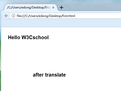
html如何把按钮居中
HTML中,可以通过CSS将按钮居中,使用以下代码:,“`html,,,, , Button Centered, , .center-button {, text-align: center;, margin-top: 20px;, }, ,,, , Click Me, ,
HTML 如何把按钮居中
在网页设计中,将按钮居中是一个常见的需求,无论是为了美观还是用户体验,居中的按钮都能让页面看起来更加平衡和专业,下面将详细介绍几种在 HTML 中实现按钮居中的方法。
使用 CSS 的 text-align 属性
基本用法
最简单的方法是使用 CSS 的 text-align 属性,将按钮放在一个父元素中,然后设置父元素的 text-align 为 center,这样,按钮就会在父元素中水平居中。
<!DOCTYPE html>
<html lang="zh-CN">
<head>
    <meta charset="UTF-8">按钮居中示例</title>
    <style>
        .container {
            text-align: center;
            margin-top: 50px;
        }
        .btn {
            padding: 10px 20px;
            font-size: 16px;
        }
    </style>
</head>
<body>
    <div class="container">
        <button class="btn">居中按钮</button>
    </div>
</body>
</html>
在这个例子中,.container 是按钮的父元素,通过设置 text-align: center,按钮在水平方向上居中。
适用场景
这种方法适用于按钮是行内元素(如 <button>、<a> 等)或可以设置为行内元素的情况,如果按钮是块级元素,可能需要其他方法。
使用 Flexbox 布局
基本用法
Flexbox 是一种强大的布局模式,可以轻松实现元素的居中,通过设置父元素为 display: flex,并使用 justify-content 和 align-items 属性,可以实现水平和垂直方向的居中。

<!DOCTYPE html>
<html lang="zh-CN">
<head>
    <meta charset="UTF-8">Flexbox 按钮居中示例</title>
    <style>
        .flex-container {
            display: flex;
            justify-content: center; / 水平居中 /
            align-items: center;    / 垂直居中 /
            height: 200px;
            border: 1px solid #ccc;
            margin-top: 50px;
        }
        .btn {
            padding: 10px 20px;
            font-size: 16px;
        }
    </style>
</head>
<body>
    <div class="flex-container">
        <button class="btn">居中按钮</button>
    </div>
</body>
</html>
在这个例子中,.flex-container 使用了 Flexbox 布局,justify-content: center 使按钮在水平方向上居中,align-items: center 使按钮在垂直方向上居中。
适用场景
Flexbox 适用于需要精确控制布局的场景,尤其是当页面中有多个元素需要对齐时,它不仅适用于按钮居中,还可以用于复杂的布局设计。
使用 CSS Grid 布局
基本用法
CSS Grid 是另一种强大的布局工具,可以轻松实现元素的居中,通过设置父元素为 display: grid,并使用 place-items 属性,可以实现水平和垂直方向的居中。
<!DOCTYPE html>
<html lang="zh-CN">
<head>
    <meta charset="UTF-8">Grid 按钮居中示例</title>
    <style>
        .grid-container {
            display: grid;
            place-items: center; / 水平和垂直居中 /
            height: 200px;
            border: 1px solid #ccc;
            margin-top: 50px;
        }
        .btn {
            padding: 10px 20px;
            font-size: 16px;
        }
    </style>
</head>
<body>
    <div class="grid-container">
        <button class="btn">居中按钮</button>
    </div>
</body>
</html>
在这个例子中,.grid-container 使用了 Grid 布局,place-items: center 使按钮在水平和垂直方向上居中。
适用场景
CSS Grid 适用于需要处理二维布局的场景,尤其是在需要同时控制行和列的对齐时,它比 Flexbox 更适合复杂的网格布局。
使用绝对定位
基本用法
通过设置父元素为 position: relative,并将按钮设置为 position: absolute,然后使用 left 和 transform 属性,可以实现按钮的居中。
<!DOCTYPE html>
<html lang="zh-CN">
<head>
    <meta charset="UTF-8">绝对定位按钮居中示例</title>
    <style>
        .relative-container {
            position: relative;
            width: 300px;
            height: 200px;
            border: 1px solid #ccc;
            margin: 50px auto;
        }
        .btn {
            position: absolute;
            left: 50%;
            top: 50%;
            transform: translate(-50%, -50%);
            padding: 10px 20px;
            font-size: 16px;
        }
    </style>
</head>
<body>
    <div class="relative-container">
        <button class="btn">居中按钮</button>
    </div>
</body>
</html>
在这个例子中,.relative-container 是按钮的父元素,设置为 position: relative,按钮设置为 position: absolute,并通过 left: 50% 和 top: 50% 将其定位到容器的中心,然后使用 transform: translate(-50%, -50%) 进行微调,使其完全居中。
适用场景
绝对定位适用于需要精确控制元素位置的场景,尤其是在需要覆盖在其他元素上或进行复杂定位时,使用绝对定位可能会影响页面的响应式设计,需要谨慎使用。
使用表格布局
基本用法
虽然现代网页设计中不推荐使用表格布局,但在某些简单场景下,仍然可以通过表格来实现按钮的居中。
<!DOCTYPE html>
<html lang="zh-CN">
<head>
    <meta charset="UTF-8">表格布局按钮居中示例</title>
    <style>
        table {
            margin: 50px auto;
            border-collapse: collapse;
        }
        td {
            text-align: center;
            padding: 20px 0;
        }
        .btn {
            padding: 10px 20px;
            font-size: 16px;
        }
    </style>
</head>
<body>
    <table>
        <tr>
            <td><button class="btn">居中按钮</button></td>
        </tr>
    </table>
</body>
</html>
在这个例子中,使用了一个单单元格的表格,通过设置 margin: 0 auto 使表格水平居中,然后通过 text-align: center 使按钮在单元格中居中。
适用场景
表格布局适用于非常简单的页面结构,或者需要兼容非常老旧的浏览器,现代网页设计中,推荐使用 Flexbox 或 Grid 布局。
相关问答 FAQs
如何在响应式设计中保持按钮居中?
在响应式设计中,保持按钮居中需要考虑不同屏幕尺寸下的布局,推荐使用 Flexbox 或 Grid 布局,因为它们具有很好的响应式特性,使用 Flexbox 时,可以设置 .flex-container 的宽度为 100%,并确保按钮在不同屏幕尺寸下都能居中,可以使用媒体查询(@media)来调整按钮的大小和样式,以适应不同设备。
为什么使用 transform: translate(-50%, -50%) 可以实现精确居中?
当使用绝对定位时,设置 left: 50% 和 top: 50% 会将元素的左上角定位到父元素的中心,这并不会使元素本身居中,因为元素的宽度和高度会影响其位置,通过添加 transform: translate(-50%, -50%),可以将元素向左和向上移动其自身宽度和高度的 50%,从而实现精确的居中效果。